Template Editor
Entering the Template Editor
For properties that accept a template-like ItemTemplate in an ItemsRepeater, or ContentTemplate in a ContentControl - you can use the Template Editor to visually build and customize the template content.
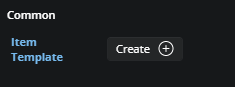
To open the Template Editor, click the Create button next to the property in the Properties panel. If a template already exists, the button will say Edit instead. Clicking it takes you into the dedicated template editing area.
Using the Template Editor
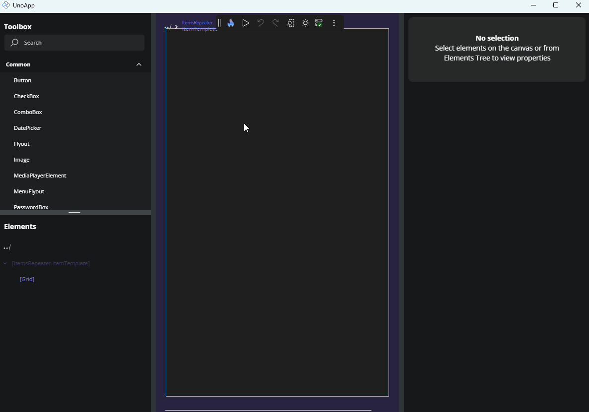
The template editor opens a separate canvas where you can design and preview the structure of your template without affecting the rest of the UI.
From here, you can:
Drag and drop elements from the Toolbox into the Tree view or directly onto the Canvas.
Build the visual structure using standard controls and layout containers.
Bind UI elements to data by selecting a control, opening the Advanced Flyout for a property, and choosing from the available bindings based on the template's
DataContext.If your control already has a data source (e.g., an
ItemsRepeaterbound to a list), those data properties will be accessible within the template for binding.
Leaving the Template Editor
To exit the template editor and return to the main layout:
Click the Back icon at the top-left of the Canvas area, or
Use the Back icon in the top-left of the Tree view.
Once you return, the control’s template will be updated with your changes, and you’ll see them reflected in the main design view.
Next Steps
-
The Properties panel automatically selects the editor best suited for each property’s data type. Visit this page to explore all available editor types and when to use them.
-
Use the Advanced Flyout to choose how a property value is provided: enter a literal Value, set up a Binding, reference a Resource, or apply Responsive Extensions for adaptive layouts.
-
Responsive Extensions let you define multiple values for a single property based on screen size or form factor, ensuring your UI adapts seamlessly across devices.
-
A hands-on walkthrough for building the Counter App using Hot Design, showcasing its features and workflow in action.