Create a Counter App with Hot Design®
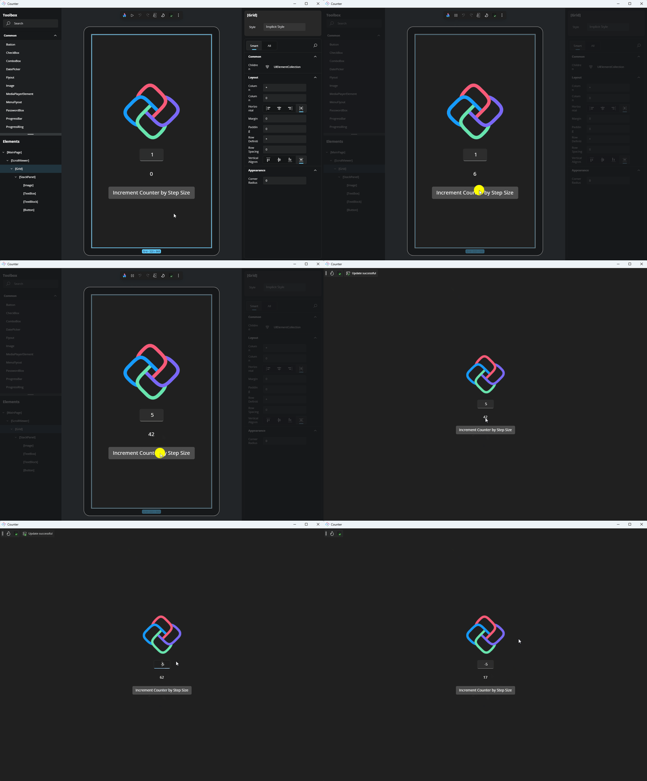
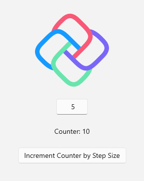
This tutorial will guide you through using Hot Design to create a simple counter application. The application will include:
- An
Imageat the top. - A
TextBoxbelow the image, where you can set the step size for incrementing the counter. - A
TextBlockbelow theTextBox, displaying the current counter value. - A
Buttonat the bottom labeled "Increment Counter by Step Size", which updates the counter value based on the step size entered.
Before You Begin
This tutorial uses the XAML + MVUX variant. You can switch to MVVM by using the MVVM variant if desired. Explore other tutorial variants in the Counter Workshop variants.
Make sure:
Your environment is set up
You're using Uno.Sdk 6.0 or higher (we recommend our newer versions to get the most out of the latest Hot Design features), by updating your project to the latest Uno.Sdk version. For detailed steps, see our migration guide. If you’re coming from Uno.Sdk 5.4 or lower, note that
EnableHotReload()in App.xaml.cs has been deprecated. Replace it withUseStudio()to keep Hot Reload working.You're signed in with your Uno Platform account (licensing steps)
You check Hot Reload platform support (Hot Design relies on Hot Reload for updates, so be sure to check the current support for your OS, IDE, and target platforms before testing.)
Note
Hot Design works independently of architectural patterns but this guide uses MVUX.
Important
To start using Hot Design, ensure you are signed in with your Uno Platform account. Follow these instructions to register and sign in.
- Hot Design is available on all platforms. See the list of current known issues.
- Hot Design does not support C# Markup and is only available with XAML and .NET 9+.
- Hot Design is not available for the WinAppSDK target framework (
netX.0-windowsX.X.X) at this time. - Hot Design relies on Hot Reload for updates, so be sure to check the current support for your OS, IDE, and target platforms before testing.
- Your input matters! Share your thoughts and help us improve Hot Design. Find out how to provide feedback here.
Creating the Counter Application
- Launch Visual Studio and click on Create new project on the Start Window. Alternatively, if you're already in Visual Studio, click New, Project from the File menu.
- Type "Uno Platform" in the search box
- Click Uno Platform App, then Next
- Name the project
Counterand click Create
At this point you'll enter the Uno Platform Template Wizard, giving you options to customize the generated application. For this tutorial, we're only going to configure the presentation framework.
- Select Blank in Presets selection
- Select the Presentation tab and choose MVUX
- Click Create to complete the wizard
The template will create a solution with a single cross-platform project, named Counter, ready to run.
Assets
First, we need to add the image file to the application. Download this SVG image (Open the Uno logo SVG download link, right-click on the SVG image and select "Save as") and add it to the Assets folder. Once added, rebuild the application to ensure the image is included in the application package.
Note
If you're working in Visual Studio, select the newly added logo.svg file in the Solution Explorer, open the Properties panel, and ensure the Build Action property is set to UnoImage. For other IDEs, no further action is required as the template automatically sets the Build Action to UnoImage for all files in the Assets folder.
For more information on Uno.Resizetizer functionalities, visit Get Started with Uno.Resizetizer.
Run the app
Hot Design relies on Hot Reload for updates, so be sure to check the current support for your OS, IDE, and target platforms.
Before you run the application, switch the target platform to Desktop (net9.0-desktop) to enable Hot Design during debugging. For more information on how to switch the target platform, visit the documentation page for your IDE:
- Visual Studio
- Rider
- VS Code
Important
In the status bar at the bottom left of VS Code, ensure
Counter.csprojis selected (by defaultCounter.slnis selected).
Now, let's run the app.
Enter Hot Design Mode
To start editing the UI, enter Hot Design by clicking the flame button in the diagnostics overlay that appears over your app.
Note
If you don't see the Hot Design flame button, ensure that you are signed in with your Uno Platform Account and using the latest stable 6.0 Uno.Sdk version or higher. We recommend our newer versions to get the most out of the latest Hot Design features. For detailed steps, see our migration guide.

Design the UI
When making changes via Hot Design, the XAML will automatically update to reflect your edits. Similarly, any changes made directly to the XAML will be reflected in Hot Design.
Remove Existing Elements
Remove the existing
StackPanel. In the Elements panel, select theStackPanel, right-click, and choose Delete StackPanel.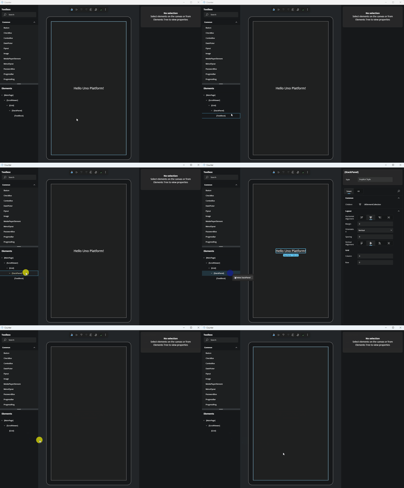
Add a StackPanel
Let's add the container to hold our elements by adding a
StackPanel. In the Toolbox panel, search for "StackPanel". Once it appears in the search results, drag it onto the Canvas.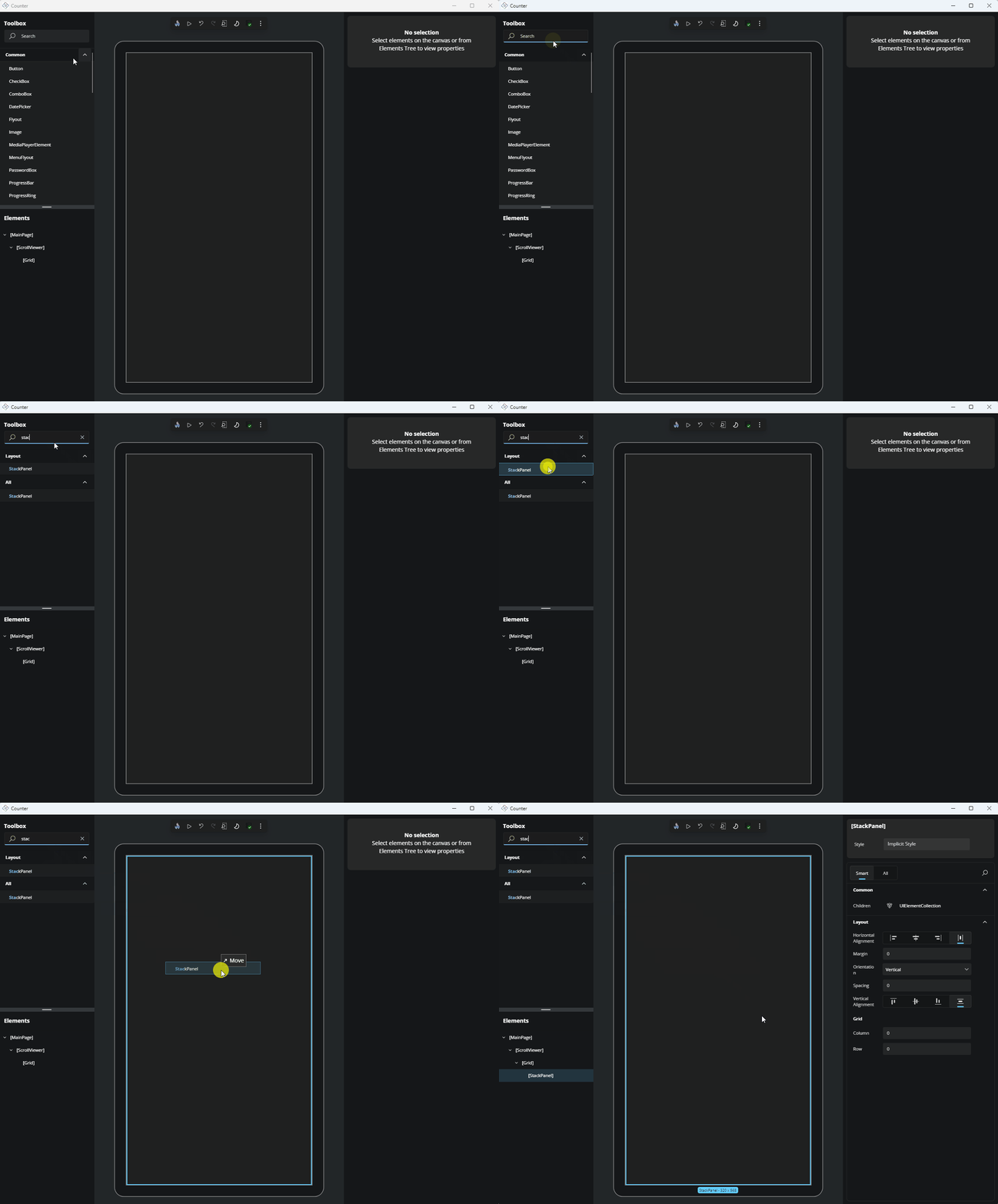
Alternatively, you can drag the element from the Toolbox and drop it onto the Elements panel.
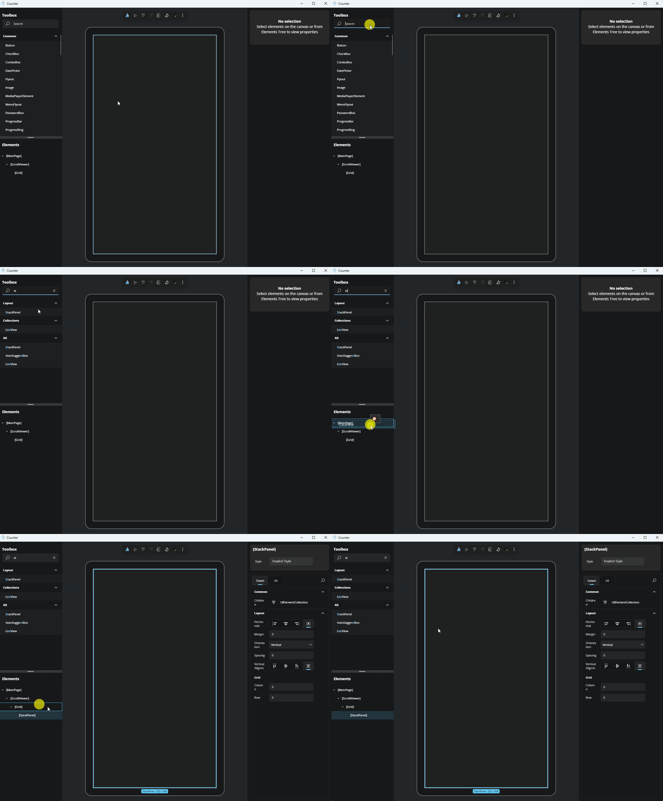
Another way would be to select the existing element in the Elements panel where you want to add a new item, then double-click the desired item in the Toolbox panel to add it as a child of the target.
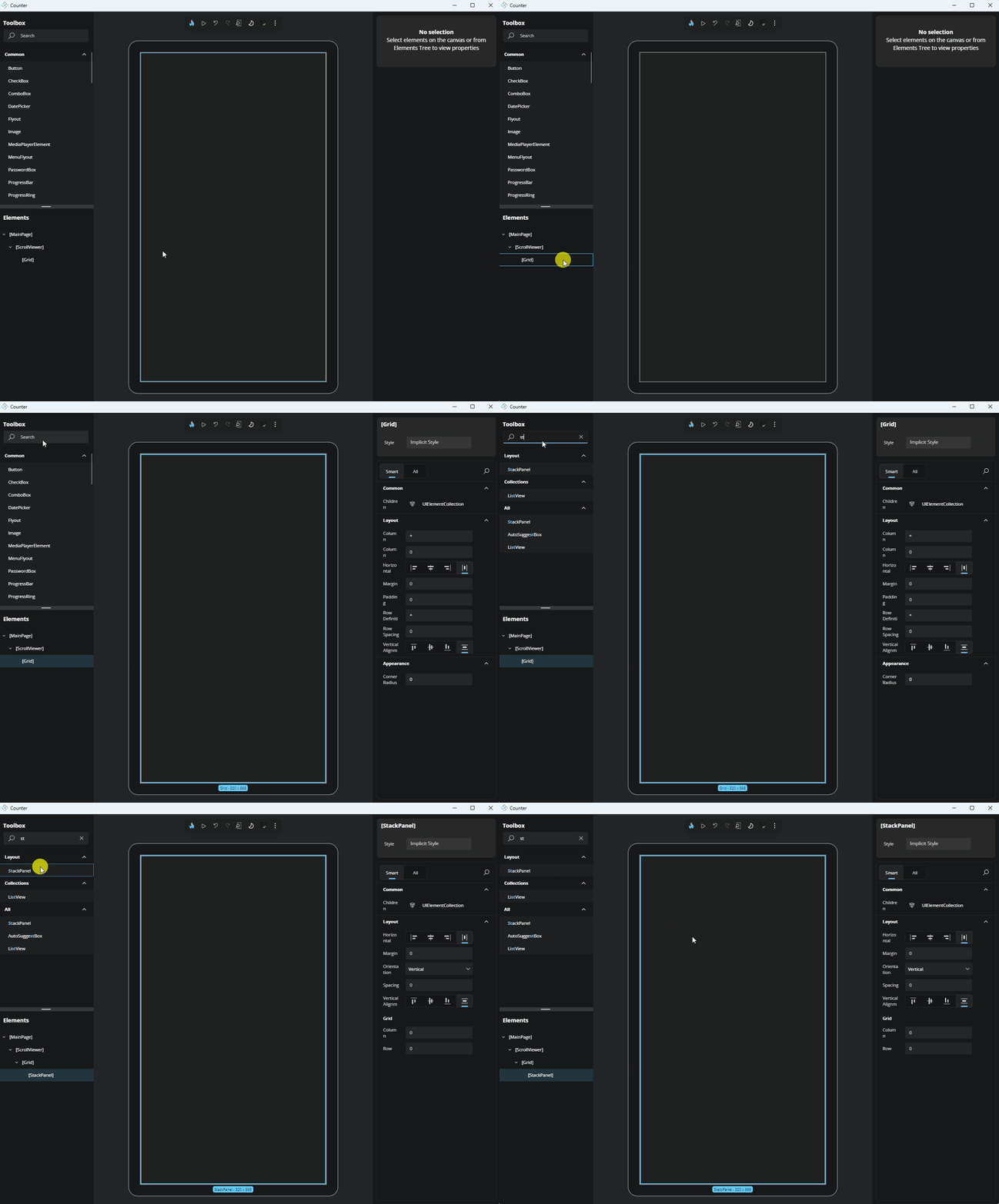
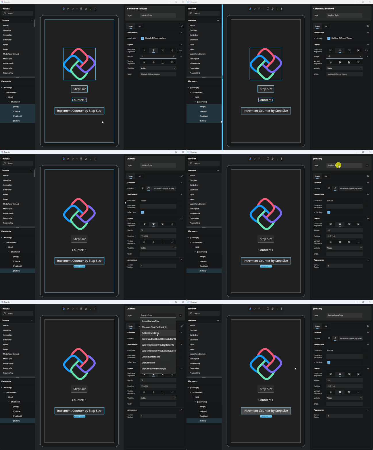
Now, let's edit a property of the
StackPanelto align it vertically and horizontally to the center. Select theStackPanelfrom the Elements panel or the Canvas. In the Properties panel, on the right side of the app, find theVerticalAlignmentproperty and set it to Center, then do the same forHorizontalAlignment.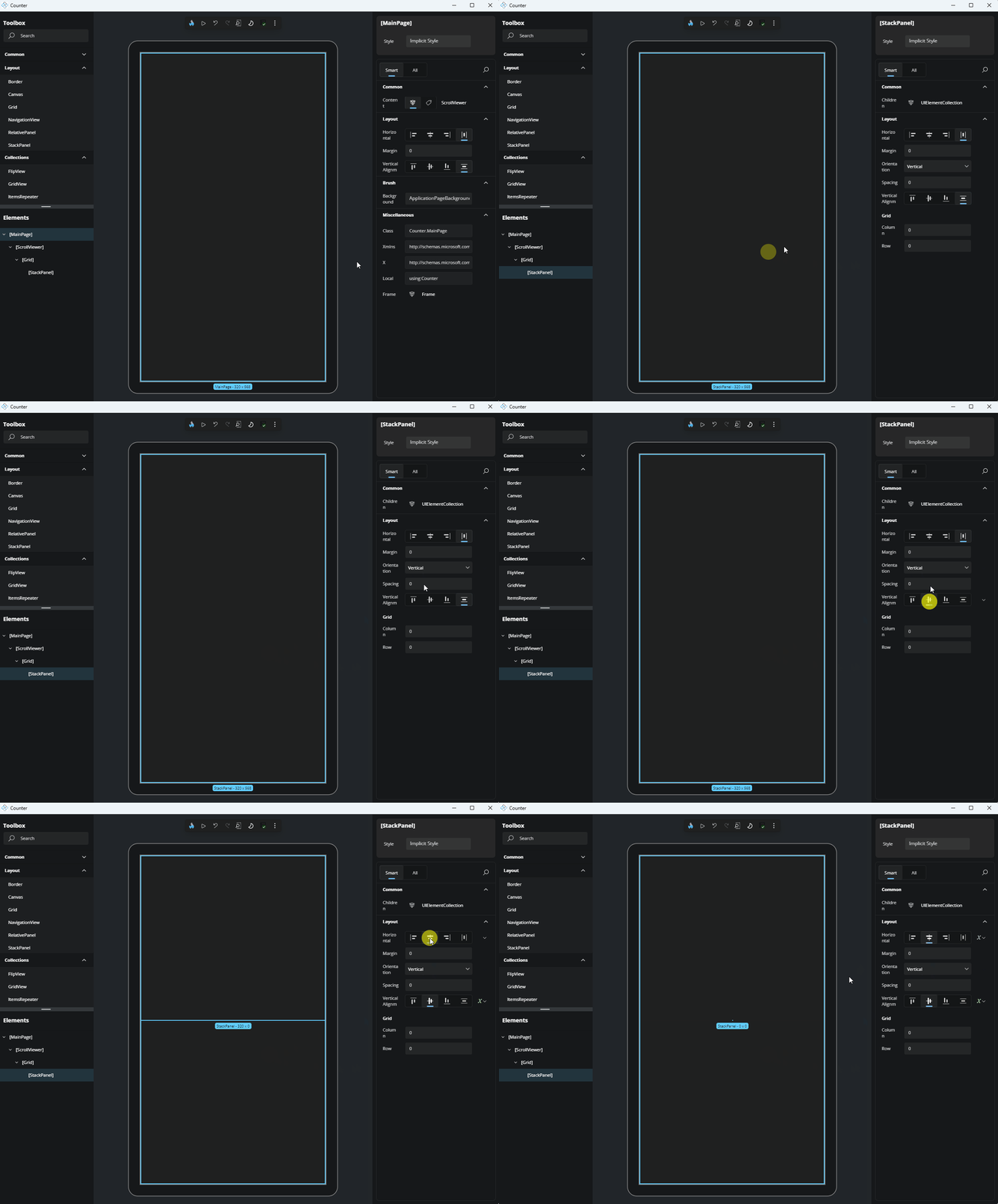
Add an Image element
Next, add an
Imageelement to theStackPanel. In the Toolbox panel, search for "Image". Once it appears in the results, drag it onto theStackPanelusing either the Canvas or the Elements panel.Now that the
Imageelement is added, let's set the source for ourImageelement. In the Properties panel, locate theSourceproperty. Start typing the name of the image we previously added, and the results should appear. Select Assets/logo.png.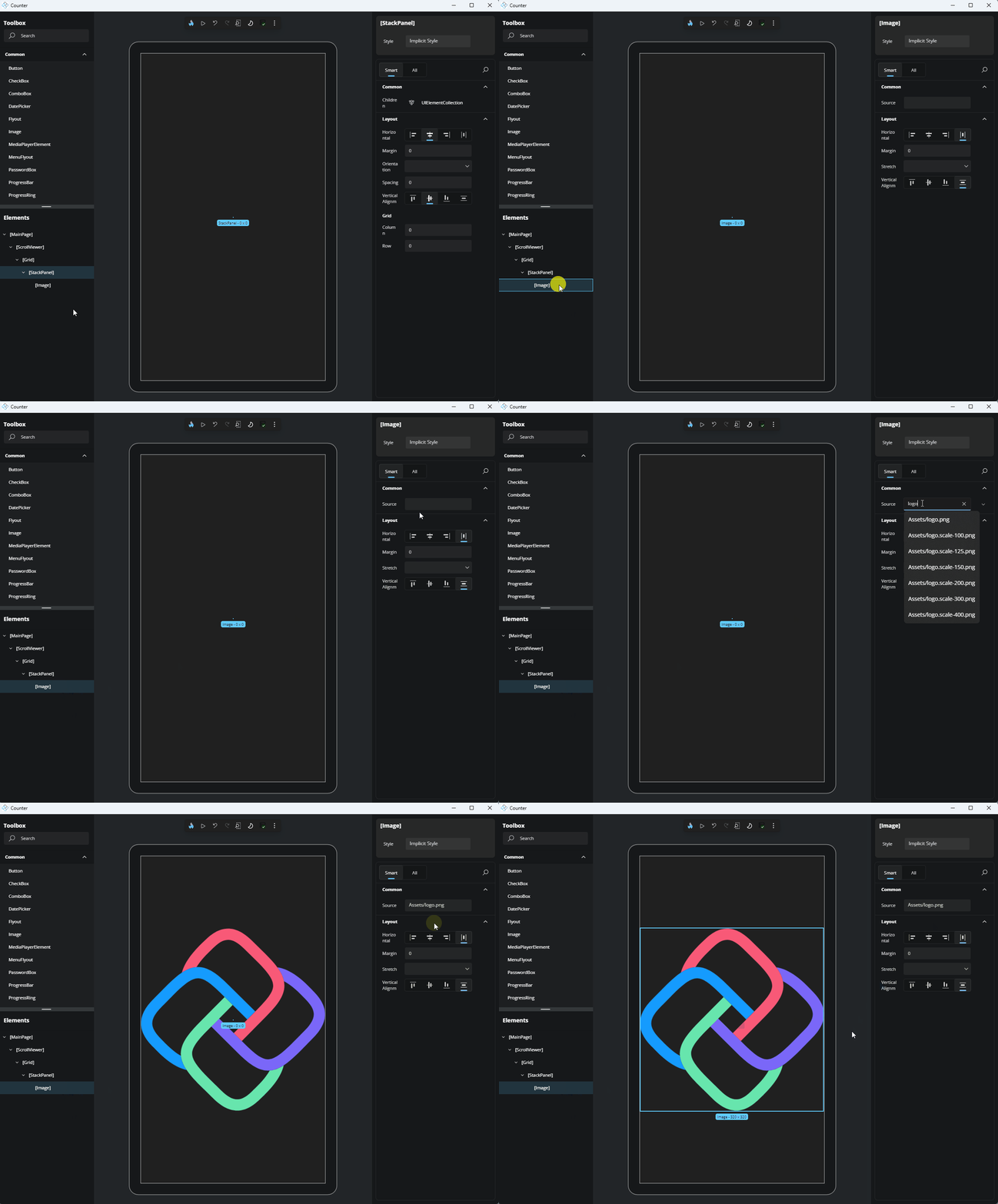
Now, let's edit some properties to enhance its appearance. In the Properties panel, use the search button to find properties. Search for "Width" and set its value to 400. Do the same for
Height. OurImageelement is now complete!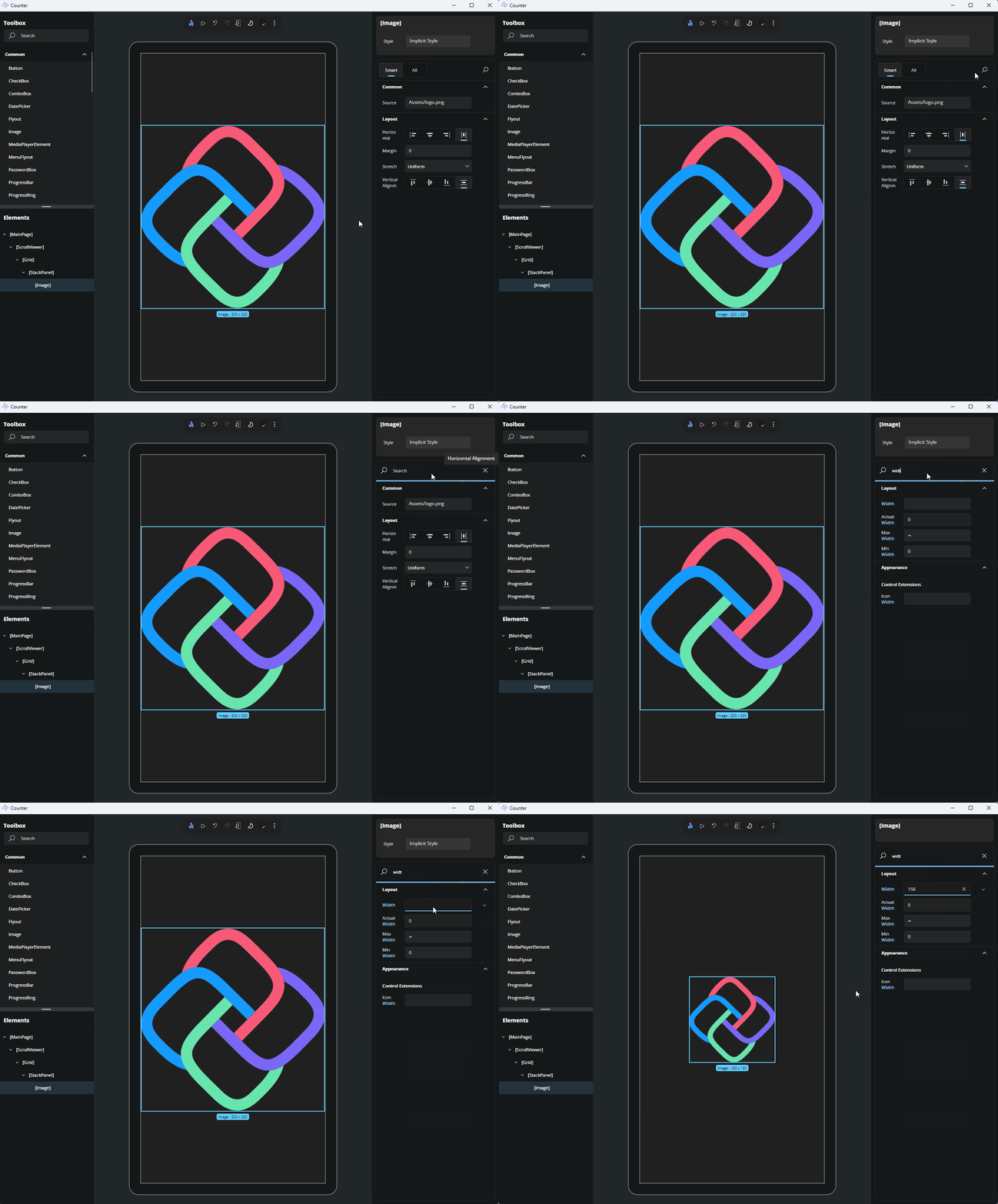
Add a TextBox element
The next step is to add a
TextBoxthat will hold the increasing step value for our Counter app. In the Toolbox panel, search for "TextBox." Once it appears in the results, drag it onto theStackPanel, making sure to place it under theImageelement.Now, let's set the
TextBoxproperties. In the Properties panel, set thePlaceholderTextto "Step Size" and set theTextAlignmentto Center. Reset theTextproperty by clicking the Advanced button to open the Advanced Property flyout, followed by clicking the Reset button.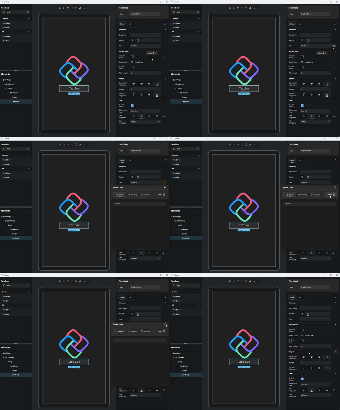
Add a TextBlock element
- The next element to add is the
TextBlock, which will display the current value of our Counter app. In the Toolbox panel, search for "TextBlock." Once it appears in the results, drag it onto theStackPanel, ensuring it is placed under theTextBox. - Let's edit the
TextBlockproperties. In the Properties panel, set theTextto "Counter: 1"; and, set theTextAlignmentto Center.
Add a Button element
- The final element is the
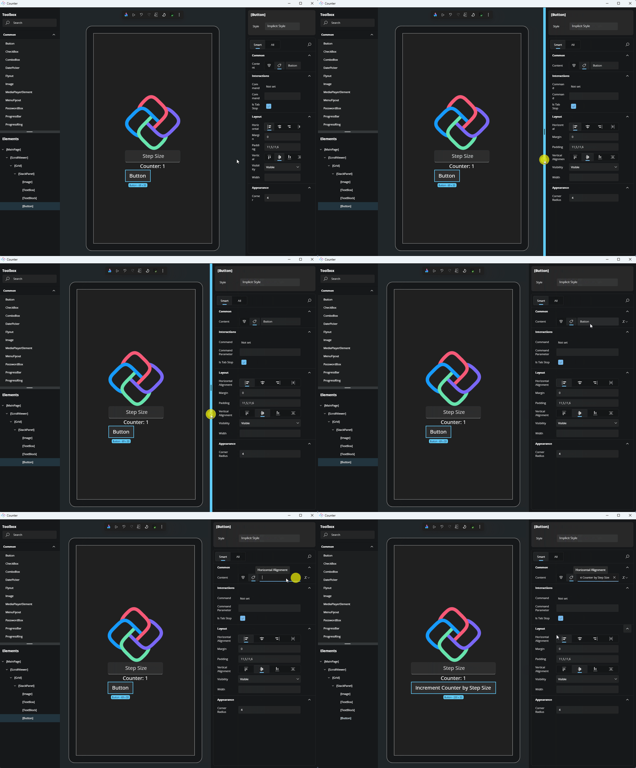
Buttonthat will increment the Count value. From the Toolbox panel, search for "Button" and once the result appears, drag it onto theStackPanel, making sure it is added under theTextBlockelement. - Set the
Buttonproperties. In the Properties panel, set theContentto "Increment Counter by Step Size".
Note
If there's insufficient room to edit the Content property you can resize the Properties panel by dragging the left edge of the Properties panel to the left.
Multi-selection
Hot Design allows you to select multiple elements and edit common properties simultaneously. Let's try it:
Hold the Ctrl key on your keyboard and click on the
Image, theTextBoxand theTextBlock(theButtonshould still be selected from the previous step) on the Canvas or in the Elements panel.In the Properties panel, set
HorizontalAlignmentto Center andMarginto 12.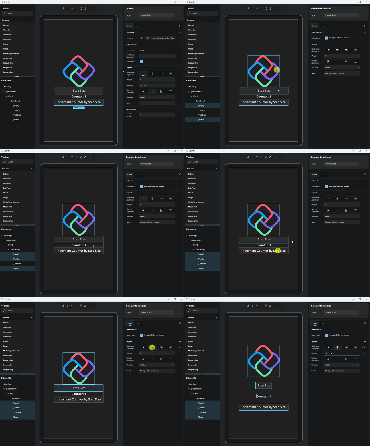
Style Picker
Hot Design allows you to apply existing styles to your elements for a polished appearance. Let's change the style of our Button:
Select the
Button, either from the Elements panel or the Canvas.At the top of the Properties panel, locate the Style Picker.
Choose ButtonRevealStyle to apply it.
MainModel and Data Binding
As part of creating the application, we selected MVUX as the presentation framework. This added a reference to MVUX which is responsible for managing our Models and generating the necessary bindings.
Without closing the application, return to your IDE and add a new class named MainModel and paste the following code to the newly created class:
namespace Counter;

internal partial record Countable(int Count, int Step)
{
    public Countable Increment() => this with
    {
        Count = Count + Step
    };
}

internal partial record MainModel
{
    public IState<Countable> Countable => State.Value(this, () => new Countable(0, 1));
    public ValueTask IncrementCounter()
            => Countable.UpdateAsync(c => c?.Increment());
}
As the application uses MVUX, the MainModel class is used to generate a bindable ViewModel, MainViewModel. Modify MainPage.xaml.cs to make an instance of MainViewModel available to be data bound and connected to the UI. Add DataContext = new MainViewModel(); to MainPage.xaml.cs right after InitializeComponent();.
After making these changes in the IDE, save all files and return to Hot Design.
Note
VS Code and Rider will automatically trigger Hot Reload when the files are saved.
In Visual Studio, you can manually trigger Hot Reload by clicking the Hot Reload button ![]() on the Visual Studio top toolbar.
on the Visual Studio top toolbar.
Set Binding
TextBox
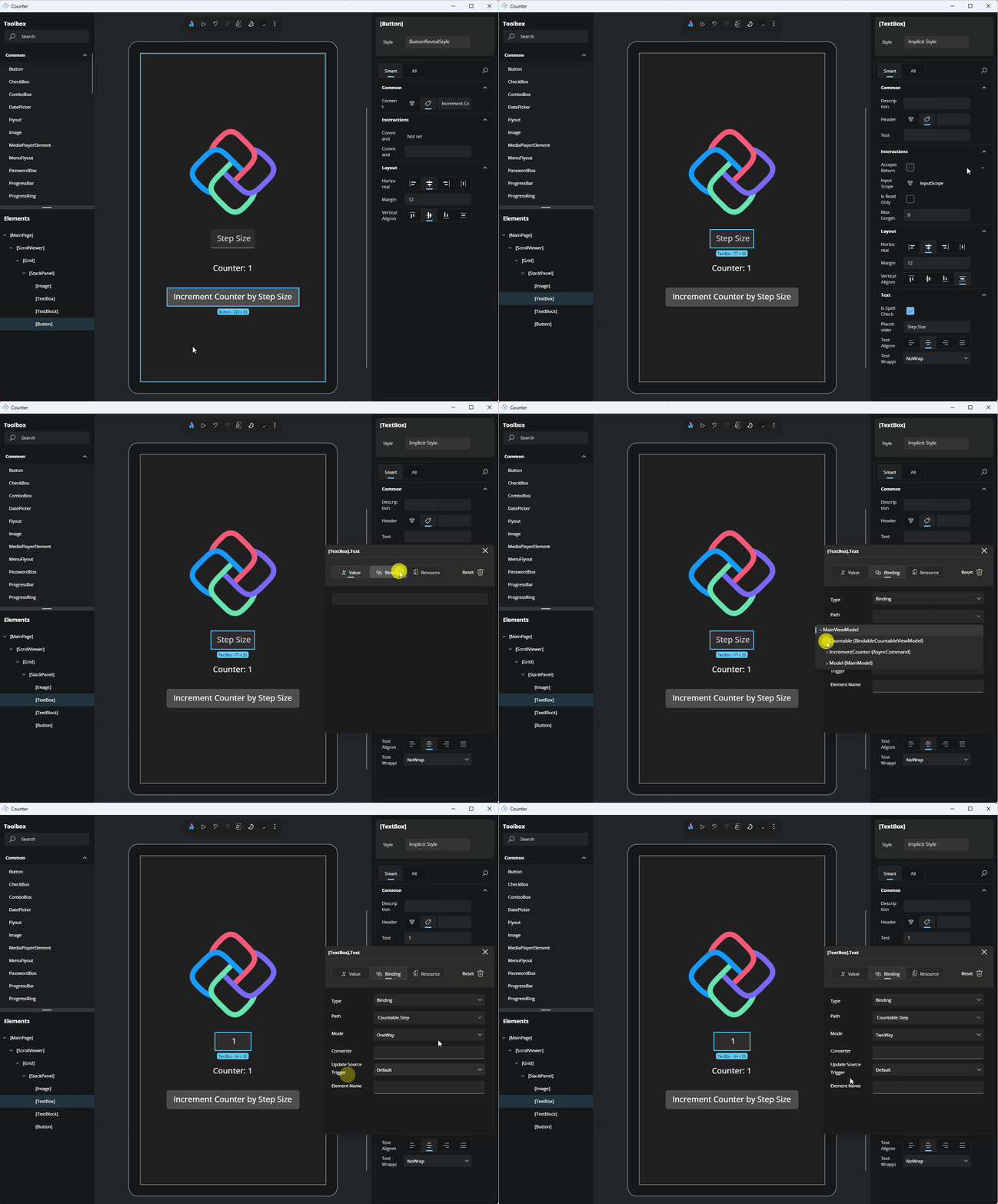
Now, we need to bind the TextBox's Text to the Countable.Step property of our ViewModel.
In the Properties panel, locate the Text property. Click the Advanced button to the right of the TextBox to open the Advanced Property flyout. Select Binding. In the Path dropdown, locate the Countable property of our ViewModel, click the arrow to expand its properties, and select Step. Finally, from the Mode dropdown, select TwoWay.
TextBlock
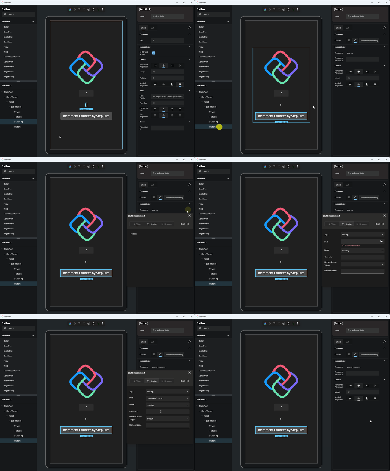
For the TextBlock, bind the Text property to Countable.Count, just as we did with the TextBox. For this step it is not necessary to set the Mode.
Button
Finally, let's bind the Command to the IncrementCounter task of our ViewModel.
Wrap Up
At this point, you should have a working counter application. Switch to the Interactive mode in the Toolbar to see the application in action. To test the app, you can adjust the step size and click the increment button.
Interactive mode lets you interact with the app directly within Hot Design, without needing to leave the editor. Once you're done interacting with the application, you can switch back to Design mode to return to modifying your application. If you wish to leave Hot Design and return to the running application, you can click the Flame button in the Toolbar.
