Counter App using XAML and MVVM
Download the complete XAML + MVVM sample
Note
Estimated time to complete: 5 minutes
Introduction
This tutorial will walk you through creating a simple counter application with Uno Platform. The application will have a Button that increments the counter, a TextBox where the user can enter the step size, and a TextBlock that displays the current value of the counter.
In this tutorial you will learn how to:
- Create a new Project with Uno Platform using Visual Studio Template Wizard or the dotnet new command
- Add elements to the XAML file to define the layout of the application
- Add code to the C# file to implement the application logic using the Model-View-ViewModel (MVVM) pattern
- Use data binding to connect the UI to the application logic
To complete this tutorial you don't need any prior knowledge of the Uno Platform, XAML, or C#.
If you're a more experienced developer, you may want to skip this tutorial and jump straight to either the SimpleCalculator or the TubePlayer sample. Both are more complex and will give you a better idea of what Uno Platform can do.
Create the Application
To get started, we're going to use the Uno Platform solution template with the simplest set of options selected. The solution template can be accessed using either Visual Studio's New Project wizard, command lines or any of the suggested IDEs below.
Note
If you don't have the Uno Platform Extension for Visual Studio installed, follow these instructions.
Launch Visual Studio and click on Create new project on the Start Window. Alternatively, if you're already in Visual Studio, click New, Project from the File menu.
Type
Uno Platformin the search boxClick Uno Platform App, then Next
Name the project
Counterand click Create
At this point you'll enter the Uno Platform Template Wizard, giving you options to customize the generated application. For this tutorial, we're only going to configure the markup language and the presentation framework.
Select Blank in Presets selection
Select the Presentation tab and choose MVVM
Select the Markup tab and choose XAML
Before completing the wizard, take a look through each of the sections and see what other options are available. You can always come back and create a new project with different options later. For more information on all the template options, see Using the Uno Platform Template.
- Click Create to complete the wizard
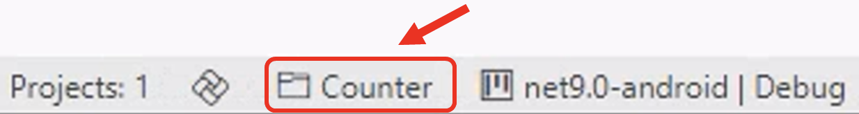
The template will create a solution with a single cross-platform project, named Counter, ready to run.
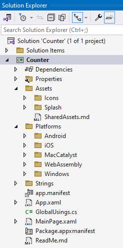
At this point, the newly created application can be opened in Visual Studio or your preferred IDE. The image below displays the Counter project, which includes files for the application's layout and business logic. Additionally, the project contains a Platforms folder for platform-specific files, a Strings folder for localization, and an Assets folder for images, icons, and other assets.
Before proceeding, you should select a target platform and run the application. For more information on debugging an application, see for Visual Studio, Visual Studio Code, or Rider.
MainWindow and MainPage
The majority of a Uno Platform application is defined in a project, in this case, named Counter. This project contains files that define the layout of the application and files that implement the application logic.
The startup logic for the application is contained in the App.xaml.cs file. In the OnLaunched method, the MainWindow of the application is initialized with a Frame, used for navigation between pages, and the MainPage is set as the initial page.
The layout for the MainPage is defined in the MainPage.xaml file. This file contains the XAML markup that defines the layout of the application. Replace your MainPage.xaml with the contents below:
<Page x:Class="Counter.MainPage"
      xmlns="http://schemas.microsoft.com/winfx/2006/xaml/presentation"
      xmlns:x="http://schemas.microsoft.com/winfx/2006/xaml"
      xmlns:local="using:Counter"
      Background="{ThemeResource ApplicationPageBackgroundThemeBrush}">
  <StackPanel HorizontalAlignment="Center"
              VerticalAlignment="Center">
    <TextBlock AutomationProperties.AutomationId="HelloTextBlock"
               Text="Hello Uno Platform"
               HorizontalAlignment="Center" />
  </StackPanel>
</Page>
This defines a page with a background set to the theme resource ApplicationPageBackgroundThemeBrush, meaning it will adapt to the theme (Dark or Light) of the application.
The page contains a StackPanel, which will lay out controls in a vertical stack and is aligned in the center of the page, both horizontally and vertically. The StackPanel contains a single TextBlock control, which displays the text Hello Uno Platform and is aligned in the horizontal center of the StackPanel.
Add a Control
We're going to replace the existing TextBlock with an Image but before we can do this, we need to add the image file to the application. Download this SVG image and add it to the Assets folder. At this point, you should rebuild the application in order for the image to be included in the application package.
Note
If you're working in Visual Studio, select the newly added logo.svg file in the Solution Explorer, open the Properties tool window, and make sure the Build Action property is set to UnoImage. For other IDEs, no further action is required as the template automatically sets the Build Action to UnoImage for all files in the Assets folder.
Including SVG files with the UnoImage build action will use Uno.Resizetizer to convert the SVG file to a PNG file for each platform. The generated PNG files will be included in the application package and used at runtime. For more information on using Uno.Resizetizer in Uno Platform, see Get Started with Uno.Resizetizer.
Now that we have the image file, we can replace the TextBlock with an Image.
Open the MainPage.xaml file.
Replace the
TextBlockwith the followingImageelement.<Image Width="150" Height="150" Source="Assets/logo.png" />
- The
WidthandHeighthave been set on theImageto ensure the image is displayed at the correct size. The Source property has been set to the path of the image file.
Run the application to see the updated MainPage. You should see the image displayed in the center of the page. Keep the application running whilst completing the rest of this tutorial. Hot Reload is used to automatically update the running application as you make changes to the application. For more information on Hot Reload, see Hot Reload.
Change the Layout
The layout of the application uses a StackPanel which allows multiple controls to be added as children and will layout them in a vertical stack. An alternative to the StackPanel that is often used to control layout within an Uno Platform application is the Grid. The Grid allows controls to be laid out in rows and columns, and is often used to create more complex layouts.
A StackPanel is a good choice for this application as we want the controls to be laid out vertically, one above the other. Let's go ahead and add the remaining controls for the counter.
Update the
StackPanelto remove theHorizontalAlignmentproperty, as we'll be centering each of the nested elements individually.<StackPanel VerticalAlignment="Center">Update the
Imageelement to center it horizontally and add a margin.<Image Width="150" Height="150" Margin="12" HorizontalAlignment="Center" Source="Assets/logo.png" />Add a
TextBoxto allow the user to enter the step size.<TextBox Margin="12" HorizontalAlignment="Center" PlaceholderText="Step Size" Text="1" TextAlignment="Center" />Add a
TextBlockto display the current counter value.<TextBlock Margin="12" HorizontalAlignment="Center" TextAlignment="Center" Text="Counter: 1" />Add a
Buttonto increment the counter.<Button Margin="12" HorizontalAlignment="Center" Content="Increment Counter by Step Size" />
ViewModel
So far all the elements we've added to the MainPage have had their content set directly. This is fine for static content, but for dynamic content, we need to use data binding. Data binding allows us to connect the UI to the application logic, so that when the application logic changes, the UI is automatically updated.
As part of creating the application, we selected MVVM as the presentation framework. This added a reference to the MVVM Toolkit package which provides a base class called ObservableObject which implements the INotifyPropertyChanged interface. This interface is used to notify the UI when a property has changed so that the UI can be updated.
Add a new class named
MainViewModel.Update the MainViewModel class to be a
partialclass and inherit from ObservableObject.internal partial class MainViewModel : ObservableObject { }Add the
_countand_stepfields to the MainViewModel class. These fields both have theObservablePropertyattribute applied, which will generate matching properties,CountandStep, that will automatically raise thePropertyChangedevent when their value is changed.[ObservableProperty] private int _count = 0; [ObservableProperty] private int _step = 1;Add a method called
Incrementto theMainViewModelthat will increment the counter by the step size. TheRelayCommandattribute will generate a matchingICommandproperty,IncrementCommand, that will call theIncrementmethod when theICommand.Executemethod is called.[RelayCommand] private void Increment() => Count += Step;
Note
If you see red squiggles under Count or Step, save the file to have Hot Reload apply your changes.
The final code for the MainViewModel class should look like this:
internal partial class MainViewModel : ObservableObject
{
[ObservableProperty]
private int _count = 0;
[ObservableProperty]
private int _step = 1;
[RelayCommand]
private void Increment()
=> Count += Step;
}
Data Binding
Now that we have the MainViewModel class, we can update the MainPage to use data binding to connect the UI to the application logic.
Add a
DataContextelement to thePageelement in the MainPage.xaml file, between the firstStackPaneland thePageelement.<Page.DataContext> <local:MainViewModel /> </Page.DataContext>Update the
TextBlockby removing theTextattribute, replacing it with twoRunelements, and binding theTextproperty of the secondRunelement to theCountproperty of theMainViewModel.<TextBlock Margin="12" HorizontalAlignment="Center" TextAlignment="Center"> <Run Text="Counter: " /><Run Text="{Binding Count}" /> </TextBlock>Update the
TextBoxby binding theTextproperty to theStepproperty of the MainViewModel. TheModeof the binding is set toTwoWayso that theStepproperty is updated when the user changes the value in theTextBox.<TextBox Margin="12" HorizontalAlignment="Center" PlaceholderText="Step Size" Text="{Binding Step, Mode=TwoWay}" TextAlignment="Center" />Update the
Buttonby adding aCommandattribute that is bound to theIncrementCommandproperty of theMainViewModel.<Button Margin="12" HorizontalAlignment="Center" Command="{Binding IncrementCommand}" Content="Increment Counter by Step Size" />
The final code for MainPage.xaml should look like this:
<Page x:Class="Counter.MainPage"
xmlns="http://schemas.microsoft.com/winfx/2006/xaml/presentation"
xmlns:x="http://schemas.microsoft.com/winfx/2006/xaml"
xmlns:local="using:Counter"
Background="{ThemeResource ApplicationPageBackgroundThemeBrush}">
<Page.DataContext>
<local:MainViewModel />
</Page.DataContext>
<StackPanel VerticalAlignment="Center">
<Image Width="150"
       Height="150"
       Margin="12"
       HorizontalAlignment="Center"
       Source="Assets/logo.png" />
<TextBox Margin="12"
HorizontalAlignment="Center"
PlaceholderText="Step Size"
Text="{Binding Step, Mode=TwoWay}"
TextAlignment="Center" />
<TextBlock Margin="12"
           HorizontalAlignment="Center"
           TextAlignment="Center">
    <Run Text="Counter: " /><Run Text="{Binding Count}" />
</TextBlock>
<Button Margin="12"
        HorizontalAlignment="Center"
        Command="{Binding IncrementCommand}"
        Content="Increment Counter by Step Size" />
</StackPanel>
</Page>
Wrap Up
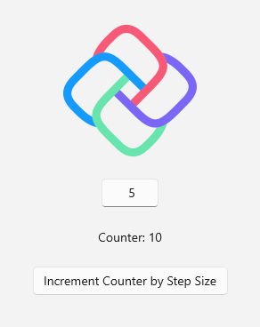
At this point, you should have a working counter application. Try changing the step size and clicking the button to increment the counter.
If you want to see the completed application, you can download the source code from GitHub.