How-To: Get Started with Uno.Resizetizer
Uno.Resizetizer is a set of MSBuild tasks designed to manage an application's assets. With this package, there's no need to worry about creating and maintaining various image sizes or setting up a splash screen. Simply, provide an SVG file, and the tool will handle everything else.
Tip
To create an app, make sure to visit our getting started tutorials.
How it works
Resizetizer uses an svg or png file as input. If an svg file is used, it will be re-scaled for different resolutions. The UnoImage, on iOS, for example, will use the x2 and x3 corresponding sizes and add them to your project for you. If a png file is used, it will not be resized, but it will be added to your project and used as one size image. If you want to know all the scales that are used, you can check this Table of scales.
For UnoIcon and UnoSplashScreen, the generated sizes will be the same as the ones used by the platform.
As svg has the ability to scale without losing quality, we strongly encourage the usage of svg files, to take most of the benefits of the tool. In the rest of the docs, you can assume that we are using svg files.
Tip
You can use the Resize property on UnoImage to force the resize of a png file. But be aware that the quality can be affected.
Manual Installation
Uno.Resizetizer is delivered through NuGet. In order to install it, you can either install it in your project using your IDE (this will be shown in the next steps) or added directly on your .csproj as shown in the NuGet page.
Note
If you're using the new template, you can skip this step because it is already included by default with Uno Platform 4.8 and later.
1. Installing Uno.Resizetizer
- Open your favorite IDE, in this case, it will be Visual Studio, after that open the Manage NuGet packages window.
- Search for
Uno.Resizetizerand install it over your projects.
Note
Uno.Resizetizer is compatible with projects running .NET 6 and later.
Usage
Uno.Resizetizer can handle:
- Images used in the application
- The App icon
- The splash screen
The next sections will show how to use it for each use case.
Warning
Asset file names must start with a letter or an underscore, contain only letters, digits and underscores, and include at least one letter or digit (so _.png is rejected). Use _ to separate words.
Hyphens, spaces, additional dots and non-ASCII characters are rejected, because the name becomes an Android resource identifier (R.drawable.<name>).
A name that is a Java keyword (such as class) or a Windows device name (such as aux) is rejected for the same reason.
Uppercase letters are allowed. On Android the generated resource is always lowercased, so an icon named MyIcon.svg is referenced as @mipmap/myicon.
Set UnoResizetizerErrorOnInvalidFilename to false to downgrade the validation error to a build message.
UnoImage
UnoImage is the build action used for images that will be part of the app.
2. Configure the project to use generated Images
- In the App Class library, create a folder called
Assets(if doesn't exist) and then create a folder calledImages. We now need to add assets to this folder.
Tip
Those folder names are examples. It is possible to create folders with any name and how many levels are needed.
Make sure that the build assets are configured to be UnoImage. In the csproj, to make all files inside the Assets\Images folder to be automatically configured to be UnoImage, add the following:
<ItemGroup>
    <UnoImage Include="Assets\Images\*" />
</ItemGroup>
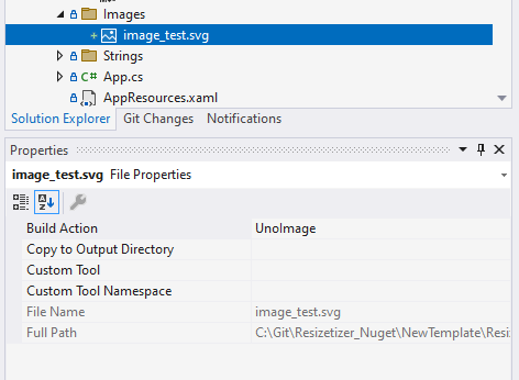
You can also make specific files to be UnoImage using Visual Studio, by right-clicking on the file, selecting Properties, then Build Action, and selecting UnoImage. The image below shows what it looks like:
3. Using the assets on the project
UnoImageassets can now be used just like any regular image. For example:
<Image Width="300"
       Height="300"
       Source="Assets/Images/my_image.png" />
Tip
Make sure to add the .png at the end of the file name
UnoIcon
UnoIcon is the build action for the app icon. There should only be one per application. The UnoIcon accepts two assets, one that represents the Foreground and another that represents the Background. During the generation phase, those files will be merged into one .png image.
During the creation of your svg file, please remember to make the ViewBox bigger than the Foreground and Background images, not adding an extra space could cause the app icon to not look good on some platforms. We recommend to add a 30% extra space on each side. This will be enough for Resizetizer to work with padding and margins.
4. Configuring the project to use generated app icon
- When you create a new Uno Platform application, an
Iconsfolder is automatically generated under theAssetsdirectory. This folder containsicon.svgandicon_foreground.svgfiles. - You can simply replace these files with your custom icons while retaining the file names, or you can customize the icon configuration using SDK properties if different names or additional configurations are needed.
- This configuration automatically applies across all target platforms included in the single project structure.
Utilizing SDK Properties
The Uno Platform SDK exposes several properties that simplify the customization of your app icon. These properties allow you to easily adjust key aspects like the base size, color, and icon files without detailed XML changes, making your development process more streamlined.
UnoIconBackgroundFile: Sets the background image file for the icon.UnoIconForegroundFile: Sets the foreground image file for the icon.UnoIconForegroundScale: Adjusts the scaling of the icon's foreground.UnoIconBackgroundColor: Sets the background color of the icon.
For basic adjustments, such as changing the icon's foreground color or applying a common modification across platforms, you can use SDK properties:
<PropertyGroup>
    <UnoIconForegroundFile>Assets\Icons\customicon.svg</UnoIconForegroundFile>
    <UnoIconColor>#FF0000</UnoIconColor>
</PropertyGroup>
This setup ensures that the icon settings are centralized, simplifying the maintenance and updating process.
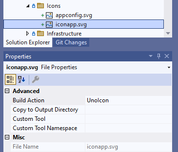
Next, some adjustments are needed on Android, Windows (WinUI), WebAssembly, iOS, and tvOS.
Open the
Main.Android.csfile (or the file that has theAndroid.App.ApplicationAttribute), and change theIconproperty, in that attribute, to be the name of the file used in theIncludeproperty ofUnoIcon, in our case will be:[global::Android.App.ApplicationAttribute( Label = "@string/ApplicationName", Icon = "@mipmap/iconapp", //... )]
Tip
You can remove the old assets related to the app icon from the Android project.
UnoSplashScreen
UnoSplashScreen is the build action for the splash screen. There should only be one per application. The UnoSplashScreen has two more properties that you can use to adjust your asset, which are:
BaseSize: It's the size that will be used to perform the scaling of the image. The default value is the size of the asset. So, if you feel that your SplashScreen doesn't look right, you can tweak this value.BackgroundColor: It's the background color that will be used to fill the empty space on the final SplashScreen asset, for all themes unlessDarkBackgroundColoris set. The default value is#FFFFFF(white). OnUnoSplashScreen,BackgroundColoris the only background color property; see Migrating from 6.x.
On WebAssembly, a background color that is missing, empty, transparent or fully transparent (alpha 0, such as #00000000) is treated as unset: no color is written to the generated AppManifest.js and the bootstrapper loader uses its WinUI-like theme defaults (#F3F3F3 light, #202020 dark).
Dark theme splash screen (WebAssembly)
UnoSplashScreen also accepts optional properties for a theme-aware splash screen:
DarkBackgroundColor: the background color used when the browser prefers a dark theme.BackgroundColoris used for the light theme.DarkFile: the image used as the logo when the browser prefers a dark theme. TheIncludefile is the default (light) one. It is processed exactly like the main splash image (sameBaseSize,TintColorand scale), and falls back to the main image when not set. It must have a different file name than the main image.AccentColor: the accent color of the loader progress bar on WebAssembly, in both themes unlessDarkAccentColoris set. When not set, the loader follows the WinUI default accents (#0067C0in light theme,#60CDFFin dark theme).DarkAccentColor: the accent color of the loader progress bar when the browser prefers a dark theme.
<UnoSplashScreen Include="Assets\SplashScreen\splash_screen.svg"
                 BackgroundColor="#FFFFFF"
                 DarkBackgroundColor="#202020"
                 DarkFile="Assets\SplashScreen\splash_screen_dark.svg"
                 AccentColor="#FF4500"
                 DarkAccentColor="#FFB347" />
On WebAssembly this adds darkThemeBackgroundColor, splashScreenImageDark and, when BackgroundColor is set, lightThemeBackgroundColor to the generated AppManifest.js. splashScreenColor is still written (from BackgroundColor) for older bootstrappers. AccentColor and DarkAccentColor add accentColor and darkThemeAccentColor. A color that is missing, empty, transparent or fully transparent is treated as unset and its key is not written. Without these properties the generated manifest is unchanged.
Note
Reacting to the dark theme requires a version of Uno.Wasm.Bootstrap with the theme-aware loader (Uno.Wasm.Bootstrap#1097). For the hand-off from the loader to the app, the Uno Toolkit ExtendedSplashScreen needs the matching support (uno.toolkit.ui#1667). Other platforms ignore these properties for now.
Migrating from 6.x
Starting with Uno Platform 7.0 (a breaking change), the splash screen background color is BackgroundColor only:
| 6.x | 7.0 |
|---|---|
<UnoSplashScreen Color="#512BD4" /> |
<UnoSplashScreen BackgroundColor="#512BD4" /> |
<UnoSplashScreenColor> (SDK property) |
<UnoSplashScreenBackgroundColor> |
A Color metadata still set on an UnoSplashScreen is ignored and the build reports warning Uno.Resizetizer0001: Color is no longer supported on UnoSplashScreen, use BackgroundColor. UnoIcon and UnoImage are not affected and keep using Color.
5. Configuring the project to use generated splash screen
- When you create a new Uno Platform application, a
Splashfolder is automatically generated under theAssetsdirectory. This folder containssplash_screen.svgfile. - You can simply replace these files with your custom splash screen while retaining the file names, or you can customize the splash screen configuration using SDK properties if different names or additional configurations are needed.
- This configuration automatically applies across all target platforms included in the single project structure.
Utilizing SDK Properties
The Uno Platform SDK exposes several properties that simplify the customization of your splash screen. These properties allow you to easily adjust key aspects like the base size, color, and icon files without detailed XML changes, making your development process more streamlined.
UnoSplashScreenFile: Specifies the image file for the splash screen.UnoSplashScreenBaseSize: Sets the base size for the splash screen image.UnoSplashScreenBackgroundColor: Determines the background color of the splash screen.UnoSplashScreenDarkBackgroundColor: Determines the background color of the splash screen in dark theme (WebAssembly).UnoSplashScreenDarkFile: Specifies the image file for the splash screen in dark theme (WebAssembly).UnoSplashScreenAccentColor: Determines the accent color of the loader progress bar (WebAssembly).UnoSplashScreenDarkAccentColor: Determines the accent color of the loader progress bar in dark theme (WebAssembly).
These properties require an Uno.Sdk version that maps them (Uno Platform 7.0 and later). UnoSplashScreenColor is no longer supported; use UnoSplashScreenBackgroundColor.
To facilitate easier customization, such as adjusting the base size or color of the splash screen, you can leverage SDK properties:
<PropertyGroup>
    <UnoSplashScreenFile>Assets\SplashScreen\custom_splash_screen.svg</UnoSplashScreenFile>
    <UnoSplashScreenBaseSize>128,128</UnoSplashScreenBaseSize>
    <UnoSplashScreenBackgroundColor>#512BD4</UnoSplashScreenBackgroundColor>
</PropertyGroup>
This setup ensures that the splash screen settings are centralized, simplifying the maintenance and updating process.
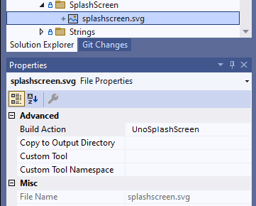
Next, some adjustments are needed on Android, Windows, and iOS.
Open the
style.xmlfile, look for theThemethat is been used by the application and add the following line:<style name="AppTheme" parent="Theme.AppCompat.Light"> <!-- Other properties --> <!-- This property is used for the splash screen --> <item name="android:windowSplashScreenBackground">@color/uno_splash_color</item> <item name="android:windowBackground">@drawable/uno_splash_image</item> <item name="android:windowSplashScreenAnimatedIcon">@drawable/uno_splash_image</item> <!-- Image at the footer --> <!-- This is not required in order to make the Splash screen work --> <!-- For more info please see: https://developer.android.com/develop/ui/views/launch/splash-screen#set-theme --> <item name="android:windowSplashScreenBrandingImage">@drawable/uno_splash_image</item> </style>
Note
The uno_splash_image and uno_splash_color are generated by the build process.
Platform-Specific Customization
The Uno Resizetizer SDK allows for detailed control over how assets are rendered on different platforms. This can be particularly useful for properties such as icon and splash screen backgrounds, which may need to vary between platforms due to design or visibility concerns.
Customizing Background Colors Per Platform
For properties like BackgroundColor, which might need different values per platform (for example, transparent backgrounds on Windows and WASM but a solid color on iOS and Android), you can specify platform-specific properties in your project file:
<PropertyGroup>
    <!-- Default background color -->
    <UnoIconBackgroundColor>#FFFFFF</UnoIconBackgroundColor>

    <!-- Platform-specific overrides using Uno SDK properties -->
    <UnoIconBackgroundColor Condition="'$(IsAndroid)' == 'true'">#000000</UnoIconBackgroundColor>
    <UnoIconBackgroundColor Condition="'$(IsIOS)' == 'true'">#FF0000</UnoIconBackgroundColor>
    <UnoIconBackgroundColor Condition="'$(IsWinAppSdk)' == 'true'">Transparent</UnoIconBackgroundColor>
    <UnoIconBackgroundColor Condition="'$(IsBrowserWasm)' == 'true'">Transparent</UnoIconBackgroundColor>
</PropertyGroup>
This setup demonstrates setting a default background color that is overridden on specific platforms. Adjust the conditions to match your project's target frameworks as defined in your project files or SDK documentation.
Applying Platform-Specific Scale
Similarly, if you want to apply different scaling factors for the icon foreground across platforms, use the platform-specific properties:
<PropertyGroup>
    <!-- Default scale -->
    <UnoIconForegroundScale>0.5</UnoIconForegroundScale>

    <!-- Platform-specific scales using Uno SDK properties -->
    <UnoIconForegroundScale Condition="'$(IsAndroid)' == 'true'">0.6</UnoIconForegroundScale>
    <UnoIconForegroundScale Condition="'$(IsBrowserWasm)' == 'true'">0.4</UnoIconForegroundScale>
    <UnoIconForegroundScale Condition="'$(IsWinAppSdk)' == 'true'">0.3</UnoIconForegroundScale>
    <UnoIconForegroundScale Condition="'$(IsIOS)' == 'true'">0.55</UnoIconForegroundScale>
</PropertyGroup>
Using SVG Images vs PNG Images with SVG underneath
The Uno Platform allows for flexible image handling through direct SVG use or through asset generation via Uno.Resizetizer. Understanding when to use each approach can optimize your app's performance and visual quality.
Direct SVG Usage
When to Use:
- You require vector graphics to be scalable without loss of quality.
- Your app needs to dynamically change aspects of the image, such as color or size, at runtime.
How to Implement:
- Add a folder named
SvginAssetsand add your SVG file. - Set the build action of your SVG file to
Content. - Reference the SVG file directly in the Image control's Source property.
<Image Source="Assets/Svg/my_vector_image.svg" />
Using Uno.Resizetizer for SVG to PNG Conversion
When to Use:
- You need raster graphics to optimize performance on platforms where SVG rendering might be less efficient.
- Your app targets multiple platforms and requires consistent image rendering across all.
How to Implement:
- Set the build action of your SVG file to UnoImage.
- Uno.Resizetizer will generate PNG assets at various scales.
- Reference the generated PNG in the Image control's Source property.
<Image Source="Assets/Images/my_vector_image.png" />
Choosing between direct SVG usage and PNG conversion with Uno.Resizetizer depends on your specific application needs. Consider factors such as platform target, performance requirements, and how you plan to manipulate the images within your app.
Sample App Example
A sample app is available here as an example for all the previous steps detailed above.
Troubleshooting
Windows (WinUI)
In some cases, the OS caches the app icon and your changes might not be applied. To fix this issue, first uninstall your app and then use one of the following options:
- In the run dialog (Win + R) execute
ie4uinit.exe -ClearIconCache - Restart
explorer.exeprocess (in Task Manager - Details selectexplorer.exein the list and click on Restart task). - Reboot your PC
Afterward, try to deploy the app again and your icons should be updated correctly.
Icon Assets
The Icon Extension generation will not succeed if the project cannot find /Assets/Icons/icon.svg and /Assets/Icons/icon_foreground.svg. You can find the related GitHub issue here.
Without these icon assets, a reference error will occur: CS0234: The type or namespace name 'Resizetizer' does not exist in the namespace 'Uno' (are you missing an assembly reference?).