Elements
The Elements panel gives you a hierarchical view of your app’s user interface. It reflects the XAML visual tree and shows how controls are nested and organized on the current page. You can use it to select elements, change layout structure, wrap items in containers, or quickly jump between components, making it easier to manage complex UIs during live design.
Whether you're organizing layout containers, editing a UserControl, or deleting an unused element, the Elements panel gives you precise control over your app’s structure.
Select Elements in the Visual Tree
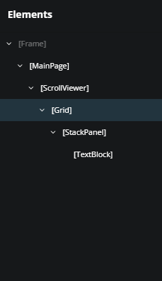
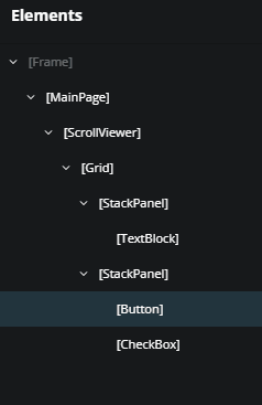
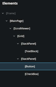
Click an element in the visual tree to select it. The selected element also highlights in the Canvas so you can see where it is.
Select Multiple Elements
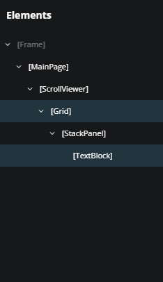
Hold Ctrl (or Cmd on macOS) and click multiple items to select them together. This is helpful when applying the same property changes to multiple elements.
Rearrange Elements with Drag and Drop
To move an element:
- Click and drag it within the visual tree in the Elements panel.
- Drop it where you want it, either within the same parent or under a different one.
You can:
Reorder elements within the same container
Move an element to a new parent, such as placing a
Buttoninside anotherStackPanel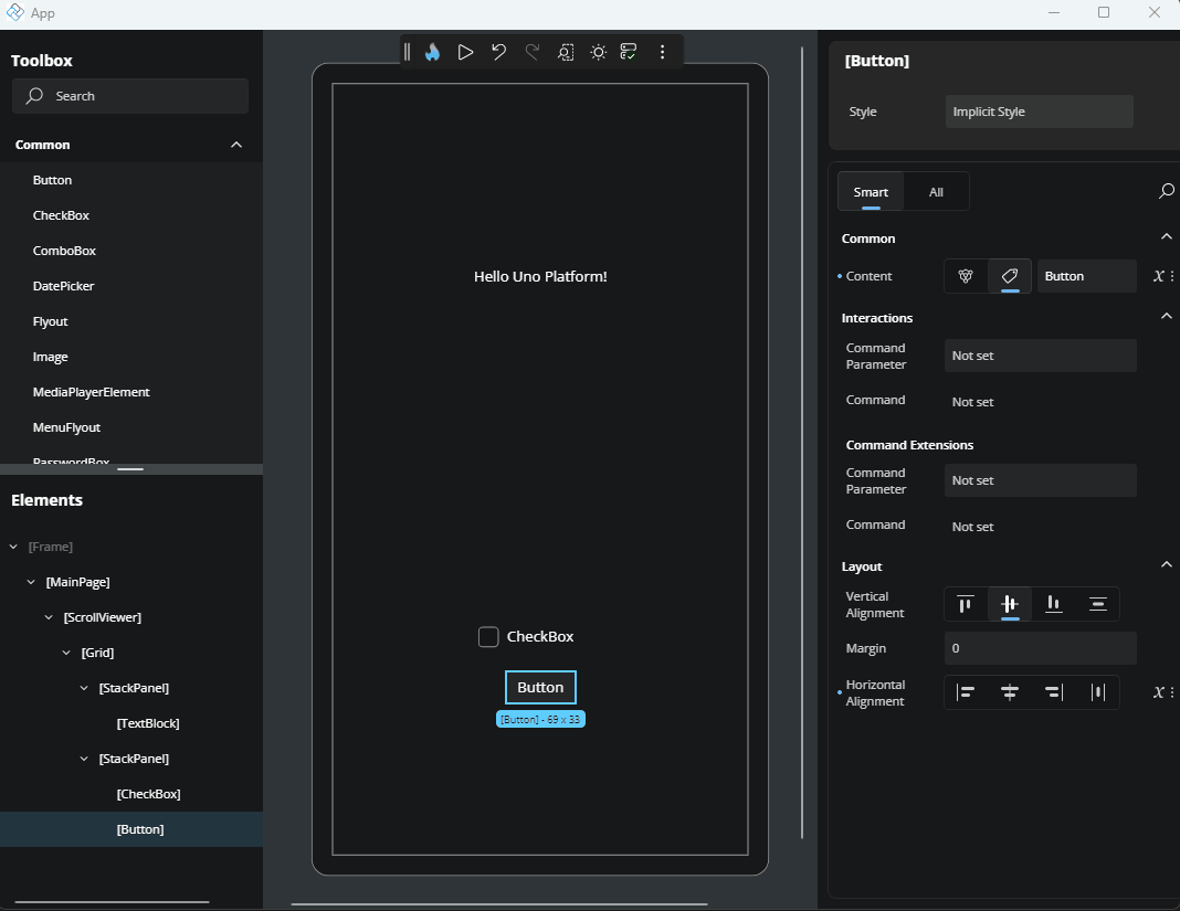
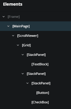
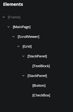
Expand and Collapse Containers
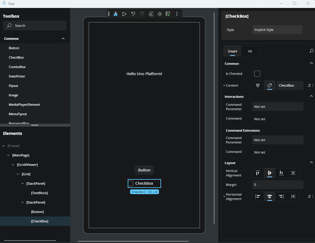
Panel elements like Grid, Border, and StackPanel can contain child elements. In the visual tree, these appear as expandable nodes having multiple children.
Content controls like Border or Viewbox can have only one child.
Use the arrow next to a node to collapse or expand it. This helps reduce visual clutter and focus on the part you're actively editing.
Wrap an Element with a New Parent
To nest an element inside a new container:
- Right-click the element.
- Choose Add parent.
- Select a layout control (e.g.,
StackPanel,Grid) from the list.
This places the selected element inside the new parent and updates the visual tree accordingly.
Jump to an Element’s Parent
To quickly select an element’s parent:
- Right-click the child element.
- Choose Select parent.
This selects the parent in both the Elements panel and the Canvas, helping you navigate complex trees.
Delete an Element from the Visual Tree
To remove an element:
- Right-click it.
- Choose Delete [ElementName] (e.g., Delete Button).
The element is immediately removed from the layout and visual tree.
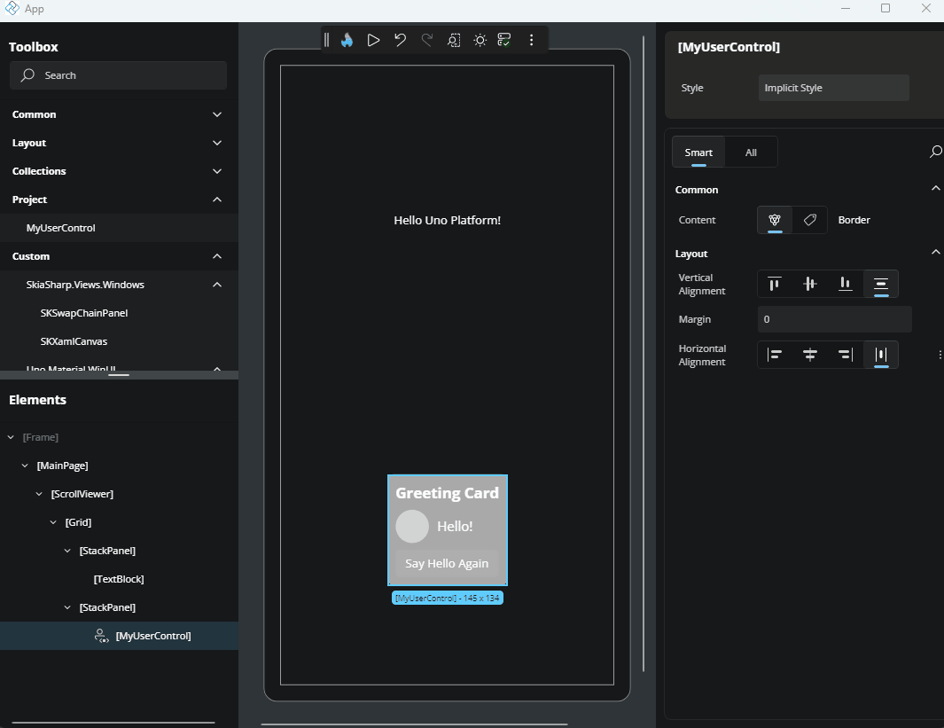
Edit a UserControl from the Visual Tree
A UserControl is a reusable part of your app that groups UI elements and their behaviors. It is commonly used to organize parts of your interface into self-contained, maintainable units that can be reused across different parts of your application.
If your page includes a UserControl, you can edit it directly by:
- Clicking the pencil icon next to the
UserControlin the visual tree. - Or, right-clicking the node and choosing Edit [UserControlName].
This opens the editor for the UserControl, allowing you to modify its internal structure or layout. To return to your previous page edition, click the ../ back icon in the top-left corner of the interface or the Elements panel.
NavigationBar Command Collections
The NavigationBar control exposes two UI collections in the Elements panel:
- PrimaryCommands
- SecondaryCommands
Hover & Add
Hover over either
PrimaryCommandsorSecondaryCommandsin the tree and a + icon appears.Click the + to open a lite, dismissible flyout listing all compatible element types (e.g.
AppBarButton,AppBarSeparator,AppBarToggleButton):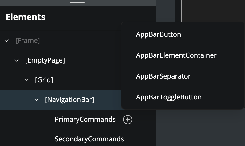
Select a type to insert it at the end of the collection.
Tip: if your collection already contains many items, the flyout will show a “Too many items” tip prompting you to drag from the Toolbox instead of scrolling through a very long list.
Reorder & Remove
Reorder by dragging the item up or down.
Remove by selecting one or more command nodes and pressing Delete, or by right‑clicking and choosing Delete.
Incompatible Drag‑and‑Drop
If you attempt to drag an element that isn’t valid for a NavigationBar command (for example, a TextBlock), you’ll see a “no‑drop” cursor and a teaching tip explaining why.
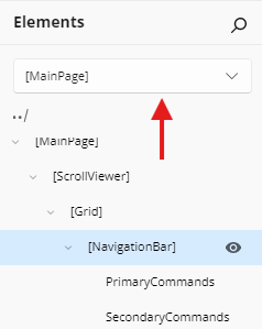
Navigate Scopes with Scope Selector
At the top of the Elements panel, you'll find the Scope Selector. This powerful feature lets you zoom into UserControls and DataTemplates for focused, isolated editing of nested UI contexts.
When you have complex nested structures like custom DataTemplates in ListBoxes or multi-level UserControl hierarchies, the Scope Selector helps you:
- Zoom into a specific scope to edit only that context without affecting parent layouts
- Navigate the scope tree to quickly switch between templates, UserControls, and the main application
- Keep designs focused by reducing visual clutter and preventing accidental changes to parent elements
Example Workflow: If your page contains a ListBox with a custom DataTemplate:
- Your Elements panel shows the page hierarchy
- Click the Scope Selector to open the scope tree
- Navigate to the ItemTemplate scope
- Edit the template content (buttons, text, icons) in isolation
- Return to Application Scope to adjust the ListBox properties
➜ Learn more about the Scope Selector