TabBar & TabBarItem
Tip
This guide covers details for TabBar and TabBarItem specifically. If you are just getting started with the Uno Toolkit Library, please see our general getting started page to make sure you have the correct setup in place.
For more information and detailed walkthroughs on using TabBar and TabBarItem, please refer to the rest of the video playlist.
Summary
Represents a control that provides a list of TabItems to select from. The TabBar selection can be used to trigger frame navigation or to toggle the visibility of views.
TabBarItem
TabBarItem is a specialized SelectorItem that includes functionality such as triggering an ICommand on click/tap or displaying a flyout.
C#
public partial class TabBarItem : SelectorItem
XAML
xmlns:utu="using:Uno.Toolkit.UI"
...

<utu:TabBarItem Content="..." />
-or-
<utu:TabBarItem ...>
    content
</utu:TabBarItem>
Inheritance
Object → DependencyObject → UIElement → FrameworkElement → Control → ContentControl → SelectorItem → TabBarItem
Constructors
| Constructor | Description |
|---|---|
TabBarItem() |
Initializes a new instance of the TabBarItem class. |
Properties
| Property | Type | Description |
|---|---|---|
BadgeValue |
string |
Gets or sets the value to be displayed in the badge of the TabBarItem. If a value is set the large badge will be displayed otherwise it will be the small badge. (Currently only supported by the Material Theme Toolkit Library with BottomTabBarItemStyle and VerticalTabBarItemStyle) |
BadgeVisibility |
Visibility |
Gets or sets the badge visibility of the TabBarItem. (Currently only supported by the Material Theme Toolkit Library with BottomTabBarItemStyle and VerticalTabBarItemStyle) |
Command |
ICommand |
Gets or sets the command to invoke when the TabBarItem is pressed. |
CommandParameter |
object |
Gets or sets the parameter to pass to the Command property. |
Flyout |
double |
Gets or sets the flyout associated with this TabBarItem. |
Icon |
IconElement |
Gets or sets the icon of the TabBarItem. |
IsSelectable |
bool |
Gets or sets whether the TabBarItem can be selected. |
Events
| Event | Type | Description |
|---|---|---|
Click |
RoutedEventHandler |
Occurs when the TabBarItem is pressed. |
TabBar
TabBar is a specialized ItemsControl used to present a collection of TabBarItems.
C#
public partial class TabBar : ItemsControl
XAML
xmlns:utu="using:Uno.Toolkit.UI"
...

<utu:TabBar .../>
-or-
<utu:TabBar ...>
    oneOrMoreItems
</utu:TabBar>
-or-
<utu:TabBar ...>
    <utu:TabBar.Items>
          oneOrMoreItems
      </utu:TabBar.Items>
</utu:TabBar>
Inheritance
Object → DependencyObject → UIElement → FrameworkElement → Control → ItemsControl → TabBar
Constructors
| Constructor | Description |
|---|---|
TabBar() |
Initializes a new instance of the TabBar class. |
Properties
| Property | Type | Description |
|---|---|---|
SelectedIndex |
int |
Gets or sets the index of the selected item. |
SelectedItem |
object |
Gets or sets the selected item. |
Orientation |
Orientation |
Gets or sets the dimension by which the items are stacked |
SelectionIndicatorContent |
object |
Gets or sets the content to be displayed as the selection indicator |
SelectionIndicatorContentTemplate |
DataTemplate |
Gets or sets the data template that is used to display the content of the selection indicator |
SelectionIndicatorPresenterStyle |
Style |
Gets or sets the style to be applied for the content of the TabBarSelectionIndicatorPresenter |
SelectionIndicatorTransitionMode |
IndicatorTransitionMode |
Gets or sets the behavior of the selection indicator. The indicator can either slide or snap to the newly selected item. Defaults to Snap |
SelectionIndicatorPlacement |
IndicatorPlacement |
Gets or sets the placement of the selection indicator. The indicator can either be displayed Above or Below the TabBarItem Content. Defaults to Above |
Note
TabBar only supports the single selection mode.
Events
All events below are forwarded from the nested TabBarItems:
| Event | Type | Description |
|---|---|---|
SelectionChanged |
TypedEventHandler<TabBar, TabBarSelectionChangedEventArgs> |
Occurs when a TabBarItem's selection state has changed. |
class TabBarSelectionChangedEventArgs : EventArgs
{
    // Gets the newly selected TabBarItem
    object? NewItem { get; }

    // Gets the previously selected TabBarItem
    object? OldItem { get; }
}
Selection Indicator
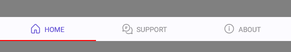
By default, the TabBar does not display an indicator for the currently selected item. If a selection indicator is needed, it can be defined by setting the SelectionIndicatorContent and/or SelectionIndicatorContentTemplate properties on TabBar. If the content for the indicator is defined, the TabBar will automatically display and position the indicator based on the SelectionIndicatorTransitionMode.
As an example, given the following TabBar:
xmlns:utu="using:Uno.Toolkit.UI"
...
<utu:TabBar Style="{StaticResource MyCustomTabBarStyle}"
SelectedIndex="0">
<utu:TabBar.SelectionIndicatorContent>
<Border Height="2"
VerticalAlignment="Bottom"
Background="Red" />
</utu:TabBar.SelectionIndicatorContent>
<utu:TabBar.Items>
<utu:TabBarItem Content="HOME">
<utu:TabBarItem.Icon>
<SymbolIcon Symbol="Home" />
</utu:TabBarItem.Icon>
</utu:TabBarItem>
<utu:TabBarItem Content="SUPPORT">
<utu:TabBarItem.Icon>
<FontIcon Glyph="" />
</utu:TabBarItem.Icon>
</utu:TabBarItem>
<utu:TabBarItem Content="ABOUT">
<utu:TabBarItem.Icon>
<FontIcon Glyph="" />
</utu:TabBarItem.Icon>
</utu:TabBarItem>
</utu:TabBar.Items>
</utu:TabBar>
The result would be:
IndicatorTransitionMode
The selection indicator has two different transition modes:
IndicatorTransitionMode.Snap(default mode):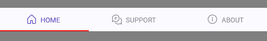
IndicatorTransitionMode.Slide:
IndicatorPlacement
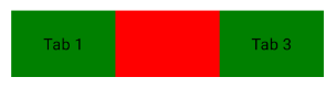
By default, the selection indicator is rendered above, on "on top" of, the actual content in the TabBar. For example, the following XAML will result in the screenshot below:
<utu:TabBar Margin="50"
            Width="300"
            SelectedIndex="1"
            Background="Green"
            VerticalAlignment="Center">
    <utu:TabBar.Items>
        <utu:TabBarItem Content="Tab 1" />
        <utu:TabBarItem Content="Tab 2" />
        <utu:TabBarItem Content="Tab 3" />
    </utu:TabBar.Items>
    <utu:TabBar.SelectionIndicatorContentTemplate>
        <DataTemplate>
            <Border Background="Red" />
        </DataTemplate>
    </utu:TabBar.SelectionIndicatorContentTemplate>
</utu:TabBar>
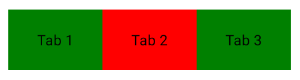
The SelectionIndicatorPlacement property can be used to render the selection indicator "below" the content so it does not obscure the TabBarItem:
<utu:TabBar Margin="50"
            Width="300"
            SelectedIndex="1"
            Background="Green"
            SelectionIndicatorPlacement="Below"
            VerticalAlignment="Center">
    <utu:TabBar.Items>
        <utu:TabBarItem Content="Tab 1" />
        <utu:TabBarItem Content="Tab 2" />
        <utu:TabBarItem Content="Tab 3" />
    </utu:TabBar.Items>
    <utu:TabBar.SelectionIndicatorContentTemplate>
        <DataTemplate>
            <Border Background="Red" />
        </DataTemplate>
    </utu:TabBar.SelectionIndicatorContentTemplate>
</utu:TabBar>
Further Customization
If further customization is required, such as custom animations when sliding the indicator, there is a SelectionIndicatorPresenterStyle property on TabBar that can be set to customize the style of the internal ContentPresenter that is used to display the selection indicator.
Responsive TabBar Layout
For responsive layouts where different TabBar instances are shown based on screen size (e.g., bottom TabBar on mobile, vertical TabBar on desktop), use the ResponsiveExtension markup extension with the Visibility property:
<!-- Bottom TabBar for mobile -->
<utu:TabBar Style="{StaticResource BottomTabBarStyle}"
            VerticalAlignment="Bottom"
            Visibility="{utu:Responsive Normal=Visible, Wide=Collapsed}">
    <!-- items -->
</utu:TabBar>

<!-- Vertical TabBar for desktop -->
<utu:TabBar Style="{StaticResource VerticalTabBarStyle}"
            HorizontalAlignment="Left"
            Visibility="{utu:Responsive Normal=Collapsed, Wide=Visible}">
    <!-- items -->
</utu:TabBar>
Styling TabBar & TabBarItem
Warning
TabBar requires an explicit Style attribute
While Toolkit provides a default style, TabBar will not have proper Material Design or Cupertino appearance without explicitly setting a Style attribute.
Always specify a style on the TabBar container:
<utu:TabBar Style="{StaticResource BottomTabBarStyle}">
    <utu:TabBarItem Content="Home">
        <utu:TabBarItem.Icon><SymbolIcon Symbol="Home"/></utu:TabBarItem.Icon>
    </utu:TabBarItem>
</utu:TabBar>
Toolkit provides a barebones default style for TabBar and TabBarItem. It is recommended to use either:
- One of the pre-built styles that come packaged within the
Uno.Toolkit.UI.MaterialorUno.Toolkit.UI.Cupertinolibraries - A custom-built style that is defined within the consuming application
The styles that exist within the Toolkit Theming Libraries are built for the most common scenarios in which a TabBar could be used.
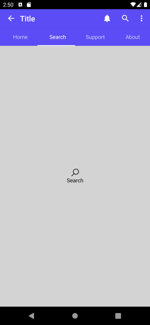
"Top" TabBar Style
A common use for a TabBar would be to use it as a means of navigation between two or more views/pages that are all at the same level of hierarchy (Lateral Navigation). If the goal is to provide lateral navigation for destinations that are at any level of the hierarchy, a TabBar styled as a TopTabBar is most appropriate.
Currently, the Material Theme Toolkit Library contains two styles for this purpose: ColoredTopTabBarStyle and TopTabBarStyle.
xmlns:utu="using:Uno.Toolkit.UI"
...

<utu:TabBar SelectedIndex="1"
            Style="{StaticResource ColoredTopTabBarStyle}">
    <utu:TabBar.Items>
        <utu:TabBarItem Content="Home" />
        <utu:TabBarItem Content="Search" />
        <utu:TabBarItem Content="Support" />
        <utu:TabBarItem Content="About" />
    </utu:TabBar.Items>
</utu:TabBar>
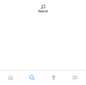
"Bottom" TabBar Style
Following the explanation of Lateral Navigation and the use case for "Top" TabBar styles, another common scenario is to use TabBar as an application's primary navigation component. In this case, we want a component that would provide lateral navigation to all top-level destinations. In this case, a TabBar styled as a BottomTabBar is most appropriate.
Currently, both the Material and Cupertino Theme Toolkit Libraries contain a BottomTabBarStyle.
xmlns:utu="using:Uno.Toolkit.UI"
...

<utu:TabBar SelectedIndex="1"
            Style="{StaticResource BottomTabBarStyle}">
    <utu:TabBarItem>
        <utu:TabBarItem.Icon>
            <SymbolIcon Symbol="Home" />
        </utu:TabBarItem.Icon>
    </utu:TabBarItem>
    <utu:TabBarItem>
        <utu:TabBarItem.Icon>
            <SymbolIcon Symbol="Find" />
        </utu:TabBarItem.Icon>
    </utu:TabBarItem>
    <utu:TabBarItem>
        <utu:TabBarItem.Icon>
            <SymbolIcon Symbol="Help" />
        </utu:TabBarItem.Icon>
    </utu:TabBarItem>
    <utu:TabBarItem>
        <utu:TabBarItem.Icon>
            <SymbolIcon Symbol="Flag" />
        </utu:TabBarItem.Icon>
    </utu:TabBarItem>
</utu:TabBar>
Material
Cupertino
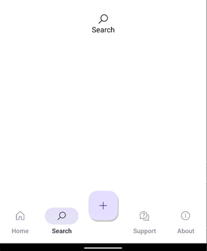
"Vertical" TabBar Style
Along with using the "Bottom" TabBar, Toolkit also provides a "Vertical" TabBar to use as an application's primary navigation component. In this case, we want a component that would provide lateral navigation to all top-level destinations.
Currently, only the Material Theme Toolkit Library contains a VerticalTabBarStyle.
xmlns:utu="using:Uno.Toolkit.UI"
...

<utu:TabBar SelectedIndex="1"
            Style="{StaticResource VerticalTabBarStyle}">
    <utu:TabBarItem>
        <utu:TabBarItem.Icon>
            <SymbolIcon Symbol="Home" />
        </utu:TabBarItem.Icon>
    </utu:TabBarItem>
    <utu:TabBarItem>
        <utu:TabBarItem.Icon>
            <SymbolIcon Symbol="Find" />
        </utu:TabBarItem.Icon>
    </utu:TabBarItem>
    <utu:TabBarItem>
        <utu:TabBarItem.Icon>
            <SymbolIcon Symbol="Help" />
        </utu:TabBarItem.Icon>
    </utu:TabBarItem>
    <utu:TabBarItem>
        <utu:TabBarItem.Icon>
            <SymbolIcon Symbol="Flag" />
        </utu:TabBarItem.Icon>
    </utu:TabBarItem>
</utu:TabBar>
Material
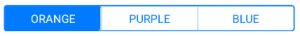
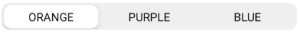
There are some styles that are built specifically for the Cupertino theme. These styles are used to emulate a UISegmentedControl
xmlns:utu="using:Uno.Toolkit.UI"
...

<utu:TabBar Style="{StaticResource SegmentedStyle}">
    <utu:TabBar.Items>
        <utu:TabBarItem Content="ORANGE" />
        <utu:TabBarItem Content="PURPLE" />
        <utu:TabBarItem Content="BLUE" />
    </utu:TabBar.Items>
</utu:TabBar>

<utu:TabBar Style="{StaticResource SlidingSegmentedStyle}">
    <utu:TabBar.Items>
        <utu:TabBarItem Content="ORANGE" />
        <utu:TabBarItem Content="PURPLE" />
        <utu:TabBarItem Content="BLUE" />
    </utu:TabBar.Items>
</utu:TabBar>
TabBarItem Style
The Uno Toolkit provides several styles of TabBarItem for both Material and Cupertino themes.
| Style Key | Material | Cupertino |
|---|---|---|
BottomFabTabBarItemStyle |
✓ | |
BottomTabBarItemStyle |
✓ | ✓ |
ColoredTopTabBarItemStyle |
✓ | |
SegmentedItemStyle |
✓ | |
SlidingSegmentedItemStyle |
✓ | |
TopTabBarItemStyle |
✓ | |
VerticalTabBarItemStyle |
✓ |
Important
Styling Pattern for TabBar in Material Toolkit v2:
Apply styles to the TabBar container, not to individual TabBarItem elements. The TabBar's style (e.g., BottomTabBarStyle, VerticalTabBarStyle, TopTabBarStyle) automatically applies the correct item styling to its children.
<utu:TabBar Style="{StaticResource BottomTabBarStyle}">
    <utu:TabBarItem Content="Home" BadgeVisibility="Visible">
        <utu:TabBarItem.Icon><SymbolIcon Symbol="Home"/></utu:TabBarItem.Icon>
    </utu:TabBarItem>
</utu:TabBar>
Exception: The BottomFabTabBarItemStyle is designed to be applied directly to specific TabBarItem elements when you want to create a Floating Action Button within a TabBar (see example below).
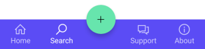
These pre-built styles can be used for more complex TabBar scenarios. For example, using the BottomFabTabBarItemStyle, we can embed Floating Action Buttons into the TabBar.
xmlns:utu="using:Uno.Toolkit.UI"
...
<utu:TabBar SelectedIndex="1"
Style="{StaticResource BottomTabBarStyle}">
<utu:TabBar.Items>
<utu:TabBarItem Content="Home">
<utu:TabBarItem.Icon>
<FontIcon Glyph="" />
</utu:TabBarItem.Icon>
</utu:TabBarItem>
<utu:TabBarItem Content="Search">
<utu:TabBarItem.Icon>
<FontIcon Glyph="" />
</utu:TabBarItem.Icon>
</utu:TabBarItem>
<utu:TabBarItem Style="{StaticResource BottomFabTabBarItemStyle}">
<utu:TabBarItem.Flyout>
<MenuFlyout MenuFlyoutPresenterStyle="{StaticResource MenuFlyoutPresenterStyle}"
Placement="Top">
<MenuFlyoutItem Style="{StaticResource MenuFlyoutItemStyle}"
Text="Like">
<MenuFlyoutItem.Icon>
<SymbolIcon Symbol="Like" />
</MenuFlyoutItem.Icon>
</MenuFlyoutItem>
<MenuFlyoutItem Style="{StaticResource MenuFlyoutItemStyle}"
Text="Dislike">
<MenuFlyoutItem.Icon>
<SymbolIcon Symbol="Dislike" />
</MenuFlyoutItem.Icon>
</MenuFlyoutItem>
</MenuFlyout>
</utu:TabBarItem.Flyout>
<utu:TabBarItem.Icon>
<SymbolIcon Symbol="Add" />
</utu:TabBarItem.Icon>
</utu:TabBarItem>
<utu:TabBarItem Content="Support">
<utu:TabBarItem.Icon>
<FontIcon Glyph="" />
</utu:TabBarItem.Icon>
</utu:TabBarItem>
<utu:TabBarItem Content="About">
<utu:TabBarItem.Icon>
<FontIcon Glyph="" />
</utu:TabBarItem.Icon>
</utu:TabBarItem>
</utu:TabBar.Items>
</utu:TabBar>
Badge usage for the Material TabBar styles
Icons in TabBar items can display badges in their upper right corners.
Badges can contain dynamic information, such as the number of new messages.
Currently, only the Material Theme Toolkit Library contains a BottomTabBarItemStyle or VerticalTabBarItemStyle that you can use to display a badge (which is optional).
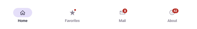
Small Badge
A small badge uses only shape to indicate a status change or new notification.

xmlns:utu="using:Uno.Toolkit.UI"
...
<utu:TabBar Style="{StaticResource BottomTabBarStyle}">
<utu:TabBarItem Content="Favorites"
BadgeVisibility="Visible">
<utu:TabBarItem.Icon>
<FontIcon Glyph="" />
</utu:TabBarItem.Icon>
</utu:TabBarItem>
</utu:TabBar>
Large Badge
A large badge displays a number within a container to indicate a quantifiable status change related to a destination.

xmlns:utu="using:Uno.Toolkit.UI"
...
<utu:TabBar Style="{StaticResource BottomTabBarStyle}">
<utu:TabBarItem Content="Mail"
BadgeValue="8"
BadgeVisibility="Visible">
<utu:TabBarItem.Icon>
<FontIcon Glyph="" />
</utu:TabBarItem.Icon>
</utu:TabBarItem>
</utu:TabBar>
Lightweight Styling
| Key | Type | Value |
|---|---|---|
NavigationTabBarWidthOrHeight |
Double |
80 |
NavigationTabBarTintOpacity |
Double |
0.8 |
NavigationTabBarItemIconHeight |
Double |
18 |
NavigationTabBarItemActiveIndicatorWidth |
Double |
64 |
NavigationTabBarItemActiveIndicatorHeight |
Double |
32 |
NavigationTabBarItemPadding |
Thickness |
0,12,0,16 |
NavigationTabBarItemActiveIndicatorCornerRadius |
CornerRadius |
16 |
TopTabBarHeight |
Double |
48 |
TopTabBarItemIconHeight |
Double |
20 |
TopTabBarItemContentMargin |
Thickness |
0 |
FabTabBarItemOffset |
Double |
-32 |
FabTabBarItemContentWidthOrHeight |
Double |
16 |
FabTabBarItemIconTextPadding |
Double |
12 |
FabTabBarItemCornerRadius |
CornerRadius |
16 |
FabTabBarItemPadding |
Thickness |
20 |
NavigationTabBarItemSmallBadgeHeight |
Double |
6 |
NavigationTabBarItemSmallBadgeWidth |
Double |
6 |
NavigationTabBarItemSmallBadgeMargin |
Thickness |
0,4,20,0 |
NavigationTabBarItemLargeBadgeHeight |
Double |
16 |
NavigationTabBarItemLargeBadgeMinWidth |
Double |
16 |
NavigationTabBarItemLargeBadgeMargin |
Thickness |
32,2,0,0 |
NavigationTabBarItemLargeBadgePadding |
Thickness |
4,0 |
NavigationTabBarItemLargeBadgeCornerRadius |
CornerRadius |
8 |
VerticalTabBarBackground |
SolidColorBrush |
SurfaceBrush |
BottomTabBarBackground |
SolidColorBrush |
SurfaceBrush |
TopTabBarBackground |
SolidColorBrush |
BackgroundBrush |
TopTabBarBottomBorderBrush |
SolidColorBrush |
PrimaryBrush |
ColoredTopTabBarBackground |
SolidColorBrush |
PrimaryBrush |
ColoredTopTabBarBottomBorderBrush |
SolidColorBrush |
OnPrimaryBrush |
ColoredTopTabBarItemBackground |
SolidColorBrush |
SystemControlTransparentBrush |
ColoredTopTabBarItemBackgroundPointerOver |
SolidColorBrush |
OnPrimaryHoverBrush |
ColoredTopTabBarItemBackgroundFocused |
SolidColorBrush |
OnPrimaryLowBrush |
ColoredTopTabBarItemBackgroundPressed |
SolidColorBrush |
OnPrimaryPressedBrush |
ColoredTopTabBarItemBackgroundDisabled |
SolidColorBrush |
SystemControlTransparentBrush |
ColoredTopTabBarItemBackgroundSelected |
SolidColorBrush |
SystemControlTransparentBrush |
ColoredTopTabBarItemBackgroundSelectedPointerOver |
SolidColorBrush |
OnPrimaryHoverBrush |
ColoredTopTabBarItemBackgroundSelectedPressed |
SolidColorBrush |
OnPrimaryPressedBrush |
ColoredTopTabBarItemForeground |
SolidColorBrush |
OnPrimaryMediumBrush |
ColoredTopTabBarItemForegroundPointerOver |
SolidColorBrush |
OnPrimaryMediumBrush |
ColoredTopTabBarItemForegroundFocused |
SolidColorBrush |
OnPrimaryMediumBrush |
ColoredTopTabBarItemForegroundPressed |
SolidColorBrush |
OnPrimaryMediumBrush |
ColoredTopTabBarItemForegroundDisabled |
SolidColorBrush |
SystemControlDisabledBaseMediumLowBrush |
ColoredTopTabBarItemForegroundSelected |
SolidColorBrush |
OnPrimaryBrush |
ColoredTopTabBarItemForegroundSelectedPointerOver |
SolidColorBrush |
OnPrimaryBrush |
ColoredTopTabBarItemForegroundSelectedPressed |
SolidColorBrush |
OnPrimaryBrush |
ColoredTopTabBarItemIconForeground |
SolidColorBrush |
SystemControlTransparentBrush |
ColoredTopTabBarItemIconForegroundPointerOver |
SolidColorBrush |
OnPrimaryMediumBrush |
ColoredTopTabBarItemIconForegroundFocused |
SolidColorBrush |
SystemControlTransparentBrush |
ColoredTopTabBarItemIconForegroundPressed |
SolidColorBrush |
OnPrimaryMediumBrush |
ColoredTopTabBarItemIconForegroundDisabled |
SolidColorBrush |
SystemControlDisabledBaseMediumLowBrush |
ColoredTopTabBarItemIconForegroundSelected |
SolidColorBrush |
OnPrimaryBrush |
ColoredTopTabBarItemIconForegroundSelectedPointerOver |
SolidColorBrush |
OnPrimaryBrush |
ColoredTopTabBarItemIconForegroundSelectedPressed |
SolidColorBrush |
OnPrimaryBrush |
ColoredTopTabBarItemPointerFillBrush |
SolidColorBrush |
SystemControlTransparentBrush |
ColoredTopTabBarItemPointerFillBrushPointerOver |
SolidColorBrush |
OnPrimaryHoverBrush |
ColoredTopTabBarItemPointerFillBrushFocused |
SolidColorBrush |
OnPrimaryLowBrush |
ColoredTopTabBarItemPointerFillBrushPressed |
SolidColorBrush |
OnPrimaryPressedBrush |
ColoredTopTabBarItemPointerFillBrushDisabled |
SolidColorBrush |
SystemControlTransparentBrush |
ColoredTopTabBarItemPointerFillBrushSelected |
SolidColorBrush |
SystemControlTransparentBrush |
ColoredTopTabBarItemPointerFillBrushSelectedPointerOver |
SolidColorBrush |
OnPrimaryHoverBrush |
ColoredTopTabBarItemPointerFillBrushSelectedPressed |
SolidColorBrush |
OnPrimaryPressedBrush |
ColoredTopTabBarItemRippleFeedback |
SolidColorBrush |
PrimaryBrush |
FabTabBarItemBackground |
SolidColorBrush |
PrimaryContainerBrush |
FabTabBarItemBackgroundPointerOver |
SolidColorBrush |
OnPrimaryContainerHoverBrush |
FabTabBarItemBackgroundFocused |
SolidColorBrush |
OnPrimaryContainerFocusedBrush |
FabTabBarItemBackgroundPressed |
SolidColorBrush |
OnPrimaryContainerPressedBrush |
FabTabBarItemBackgroundDisabled |
SolidColorBrush |
OnSurfaceDisabledBrush |
FabTabBarItemBackgroundSelected |
SolidColorBrush |
SystemControlTransparentBrush |
FabTabBarItemBackgroundSelectedPointerOver |
SolidColorBrush |
SystemControlTransparentBrush |
FabTabBarItemBackgroundSelectedPressed |
SolidColorBrush |
SystemControlTransparentBrush |
FabTabBarItemForeground |
SolidColorBrush |
OnPrimaryContainerBrush |
FabTabBarItemForegroundPointerOver |
SolidColorBrush |
OnPrimaryContainerBrush |
FabTabBarItemForegroundFocused |
SolidColorBrush |
OnPrimaryContainerBrush |
FabTabBarItemForegroundPressed |
SolidColorBrush |
OnPrimaryContainerBrush |
FabTabBarItemForegroundDisabled |
SolidColorBrush |
OnSurfaceDisabledBrush |
FabTabBarItemForegroundSelected |
SolidColorBrush |
SystemControlTransparentBrush |
FabTabBarItemForegroundSelectedPointerOver |
SolidColorBrush |
SystemControlTransparentBrush |
FabTabBarItemForegroundSelectedPressed |
SolidColorBrush |
SystemControlTransparentBrush |
FabTabBarItemIconForeground |
SolidColorBrush |
SystemControlTransparentBrush |
FabTabBarItemIconForegroundPointerOver |
SolidColorBrush |
SystemControlTransparentBrush |
FabTabBarItemIconForegroundFocused |
SolidColorBrush |
SystemControlTransparentBrush |
FabTabBarItemIconForegroundPressed |
SolidColorBrush |
SystemControlTransparentBrush |
FabTabBarItemIconForegroundDisabled |
SolidColorBrush |
OnSurfaceDisabledBrush |
FabTabBarItemIconForegroundSelected |
SolidColorBrush |
SystemControlTransparentBrush |
FabTabBarItemIconForegroundSelectedPointerOver |
SolidColorBrush |
SystemControlTransparentBrush |
FabTabBarItemIconForegroundSelectedPressed |
SolidColorBrush |
SystemControlTransparentBrush |
NavigationTabBarItemActiveIndicatorBackground |
SolidColorBrush |
SystemControlTransparentBrush |
NavigationTabBarItemActiveIndicatorBackgroundPointerOver |
SolidColorBrush |
OnSurfaceVariantHoverBrush |
NavigationTabBarItemActiveIndicatorBackgroundPressed |
SolidColorBrush |
OnSurfaceVariantPressedBrush |
NavigationTabBarItemActiveIndicatorBackgroundDisabled |
SolidColorBrush |
SystemControlTransparentBrush |
NavigationTabBarItemActiveIndicatorBackgroundSelected |
SolidColorBrush |
SecondaryContainerBrush |
NavigationTabBarItemActiveIndicatorBackgroundSelectedPointerOver |
SolidColorBrush |
OnSurfaceHoverBrush |
NavigationTabBarItemActiveIndicatorBackgroundSelectedPressed |
SolidColorBrush |
OnSurfacePressedBrush |
NavigationTabBarItemIconForeground |
SolidColorBrush |
SystemControlTransparentBrush |
NavigationTabBarItemIconForegroundPointerOver |
SolidColorBrush |
OnSurfaceVariantBrush |
NavigationTabBarItemIconForegroundPressed |
SolidColorBrush |
OnSurfaceVariantBrush |
NavigationTabBarItemIconForegroundDisabled |
SolidColorBrush |
SystemControlDisabledBaseMediumLowBrush |
NavigationTabBarItemIconForegroundSelected |
SolidColorBrush |
OnSecondaryContainerBrush |
NavigationTabBarItemIconForegroundSelectedPointerOver |
SolidColorBrush |
OnSecondaryContainerBrush |
NavigationTabBarItemIconForegroundSelectedPressed |
SolidColorBrush |
OnSecondaryContainerBrush |
NavigationTabBarItemErrorBrush |
SolidColorBrush |
ErrorBrush |
NavigationTabBarItemOnErrorBrush |
SolidColorBrush |
OnErrorBrush |
NavigationTabBarItemPointerFillBrush |
SolidColorBrush |
SystemControlTransparentBrush |
NavigationTabBarItemRippleFeedback |
SolidColorBrush |
OnSurfaceBrush |
TopTabBarItemBackground |
SolidColorBrush |
SystemControlTransparentBrush |
TopTabBarItemBackgroundPointerOver |
SolidColorBrush |
PrimaryHoverBrush |
TopTabBarItemBackgroundFocused |
SolidColorBrush |
PrimaryLowBrush |
TopTabBarItemBackgroundPressed |
SolidColorBrush |
PrimaryPressedBrush |
TopTabBarItemBackgroundDisabled |
SolidColorBrush |
SystemControlTransparentBrush |
TopTabBarItemBackgroundSelected |
SolidColorBrush |
SystemControlTransparentBrush |
TopTabBarItemBackgroundSelectedPointerOver |
SolidColorBrush |
PrimaryHoverBrush |
TopTabBarItemBackgroundSelectedPressed |
SolidColorBrush |
PrimaryPressedBrush |
TopTabBarItemForeground |
SolidColorBrush |
OnSurfaceMediumBrush |
TopTabBarItemForegroundPointerOver |
SolidColorBrush |
OnSurfaceMediumBrush |
TopTabBarItemForegroundFocused |
SolidColorBrush |
OnSurfaceMediumBrush |
TopTabBarItemForegroundPressed |
SolidColorBrush |
OnSurfaceMediumBrush |
TopTabBarItemForegroundDisabled |
SolidColorBrush |
SystemControlDisabledBaseMediumLowBrush |
TopTabBarItemForegroundSelected |
SolidColorBrush |
PrimaryBrush |
TopTabBarItemForegroundSelectedPointerOver |
SolidColorBrush |
PrimaryBrush |
TopTabBarItemForegroundSelectedPressed |
SolidColorBrush |
PrimaryBrush |
TopTabBarItemBorderBrush |
SolidColorBrush |
SystemControlTransparentBrush |
TopTabBarItemIconForeground |
SolidColorBrush |
SystemControlTransparentBrush |
TopTabBarItemIconForegroundPointerOver |
SolidColorBrush |
OnSurfaceMediumBrush |
TopTabBarItemIconForegroundFocused |
SolidColorBrush |
SystemControlTransparentBrush |
TopTabBarItemIconForegroundPressed |
SolidColorBrush |
OnSurfaceMediumBrush |
TopTabBarItemIconForegroundDisabled |
SolidColorBrush |
SystemControlDisabledBaseMediumLowBrush |
TopTabBarItemIconForegroundSelected |
SolidColorBrush |
PrimaryBrush |
TopTabBarItemIconForegroundSelectedPointerOver |
SolidColorBrush |
PrimaryBrush |
TopTabBarItemIconForegroundSelectedPressed |
SolidColorBrush |
PrimaryBrush |
TopTabBarItemPointerFillBrush |
SolidColorBrush |
SystemControlTransparentBrush |
TopTabBarItemPointerFillBrushPointerOver |
SolidColorBrush |
PrimaryHoverBrush |
TopTabBarItemPointerFillBrushFocused |
SolidColorBrush |
PrimaryLowBrush |
TopTabBarItemPointerFillBrushPressed |
SolidColorBrush |
PrimaryPressedBrush |
TopTabBarItemPointerFillBrushDisabled |
SolidColorBrush |
SystemControlTransparentBrush |
TopTabBarItemPointerFillBrushSelected |
SolidColorBrush |
SystemControlTransparentBrush |
TopTabBarItemPointerFillBrushSelectedPointerOver |
SolidColorBrush |
PrimaryHoverBrush |
TopTabBarItemPointerFillBrushSelectedPressed |
SolidColorBrush |
PrimaryPressedBrush |
TopTabBarItemRippleFeedback |
SolidColorBrush |
PrimaryBrush |
NavigationTabBarBackground |
SolidColorBrush |
SystemControlTransparentBrush |
NavigationTabBarBackgroundPointerOver |
SolidColorBrush |
SystemControlTransparentBrush |
NavigationTabBarBackgroundFocused |
SolidColorBrush |
SystemControlTransparentBrush |
NavigationTabBarBackgroundPressed |
SolidColorBrush |
SystemControlTransparentBrush |
NavigationTabBarBackgroundSelected |
SolidColorBrush |
SystemControlTransparentBrush |
NavigationTabBarBackgroundSelectedPointerOver |
SolidColorBrush |
SystemControlTransparentBrush |
NavigationTabBarBackgroundSelectedPressed |
SolidColorBrush |
SystemControlTransparentBrush |
NavigationTabBarForeground |
SolidColorBrush |
OnSurfaceVariantBrush |
NavigationTabBarForegroundPointerOver |
SolidColorBrush |
OnSurfaceVariantBrush |
NavigationTabBarForegroundPressed |
SolidColorBrush |
OnSurfaceVariantBrush |
NavigationTabBarForegroundDisabled |
SolidColorBrush |
SystemControlDisabledBaseMediumLowBrush |
NavigationTabBarForegroundSelected |
SolidColorBrush |
OnSurfaceBrush |
NavigationTabBarForegroundSelectedPointerOver |
SolidColorBrush |
OnSurfaceBrush |
NavigationTabBarForegroundSelectedPressed |
SolidColorBrush |
OnSurfaceBrush |
NavigationTabBarBorderBrush |
SolidColorBrush |
SystemControlTransparentBrush |
NavigationTabBarTintBrush |
SolidColorBrush |
SurfaceTintColor@NavigationTabBarTintOpacity |