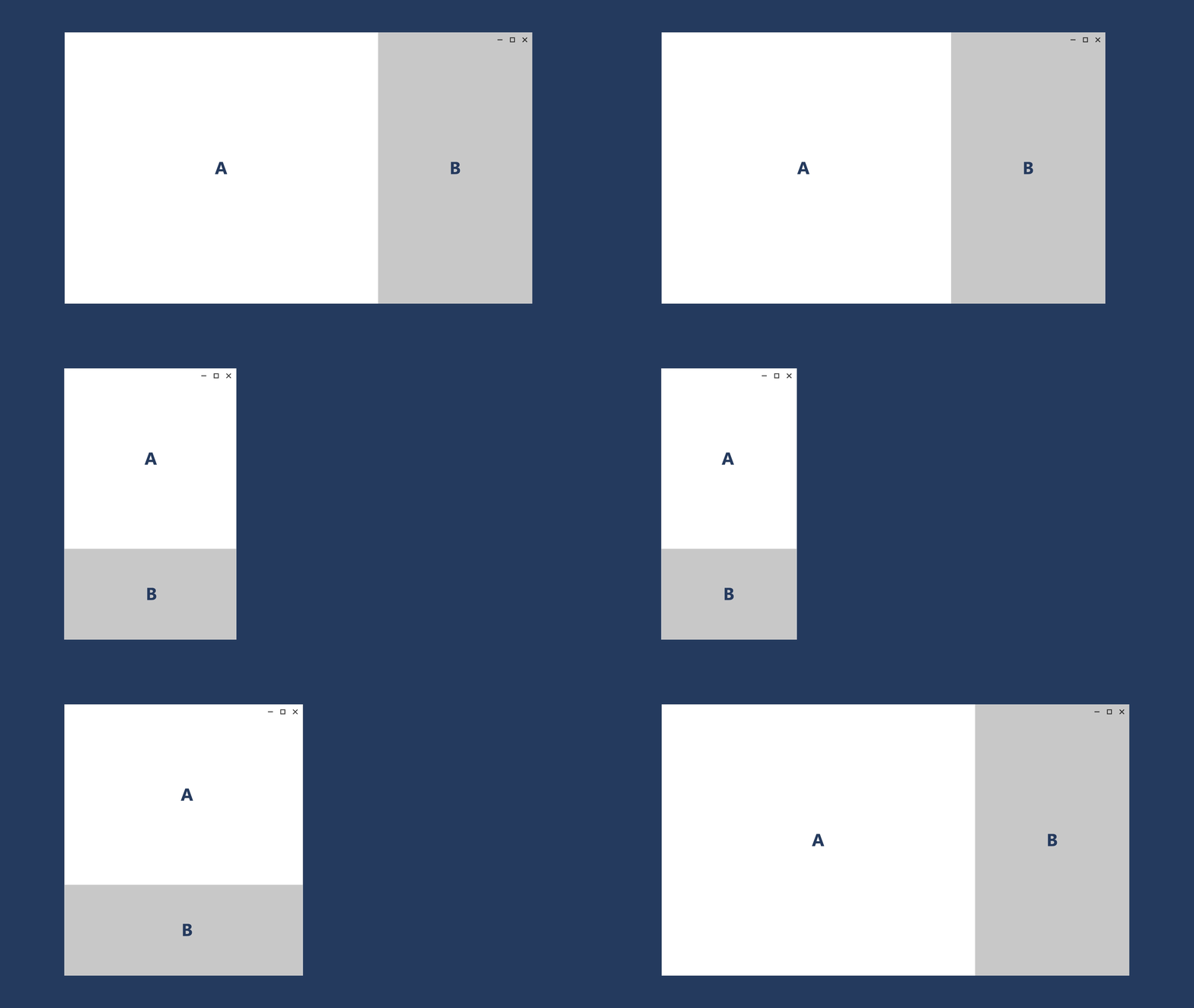
Making the App Responsive to Screen Sizes
UnoFeatures:
Toolkit(add to<UnoFeatures>in your.csproj).
Problem
XAML currently lacks a simple and flexible approach for creating responsive layouts. While options like VisualStates with AdaptiveTriggers exist, they can become cumbersome even in simple scenarios that do not involve significant UI structure changes based on screen size.
Solution
The ResponsiveExtension class is a markup extension that enables the customization of UIElement properties based on screen size.

ResponsiveExtension is conceived as a lightweight approach to responsiveness. For more complex scenarios, where the UI structure changes significantly based on screen size, consider using the ResponsiveView control.
<utu:AutoLayout Padding="{utu:Responsive Normal='16,24', Wide='40,40,40,24'}"

Source Code
- Main Page (Normal Visible TabBar)
- Main Page (Wide Visible TabBar)
- Search Page
- Home Page
- Recipe Details Page
- Create/Update Cookbook Page
- Cookbook Details Page
- Favorite Recipes Page
- Live Cooking Page
- Chart Control